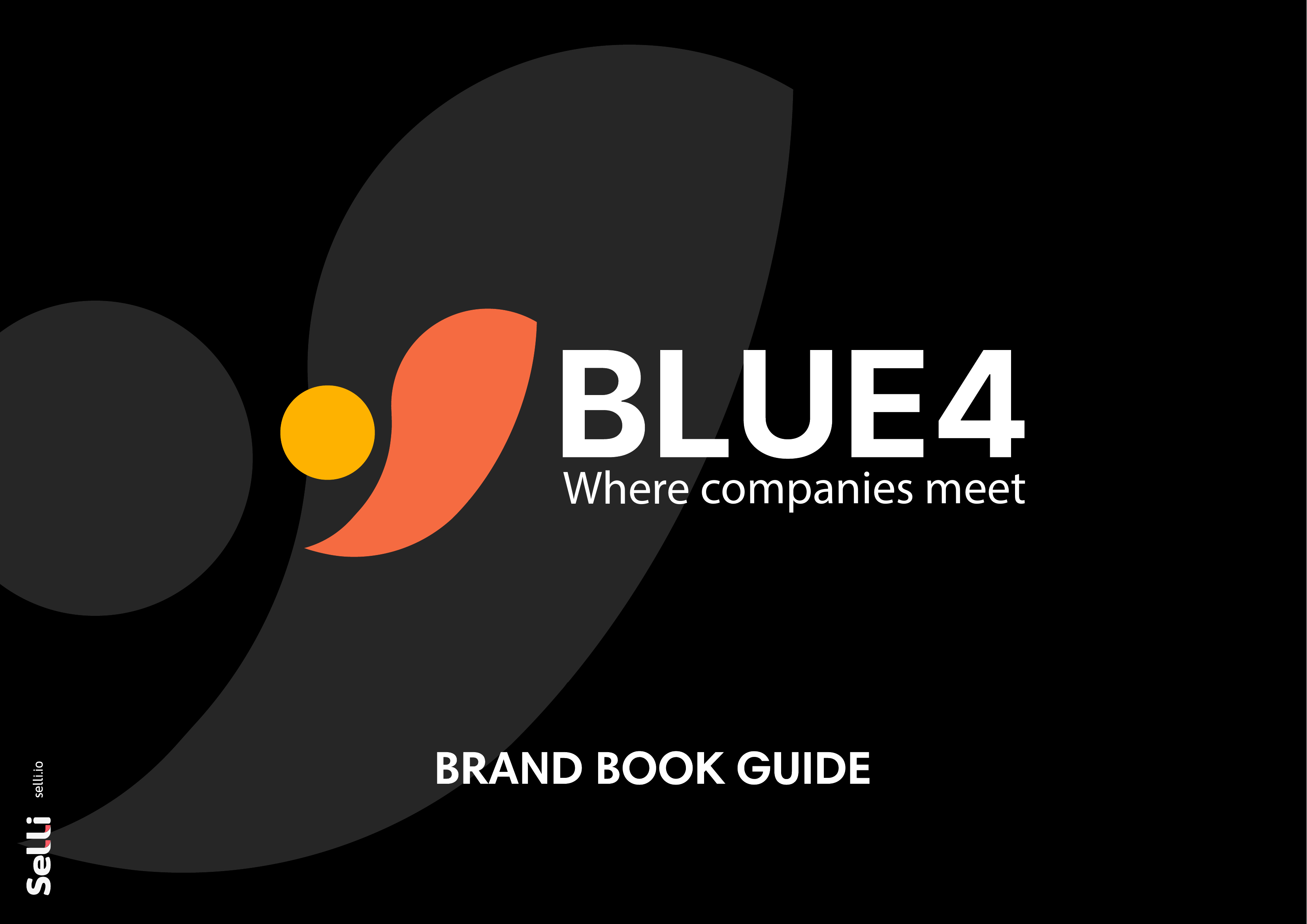
Blue 4 — "Where companies meet" (part of the Softy Business Tools ecosystem)
Blue 4 — "Where companies meet" (part of the Softy Business Tools ecosystem)
The Challenge
A B2B networking platform needed a distinctive identity capable of maintaining a visual connection with the parent brand (Softy Business Tools).
The brand had to convey solidity and reliability for a corporate audience, while simultaneously appearing dynamic and oriented towards connection and collaboration.
The Solution
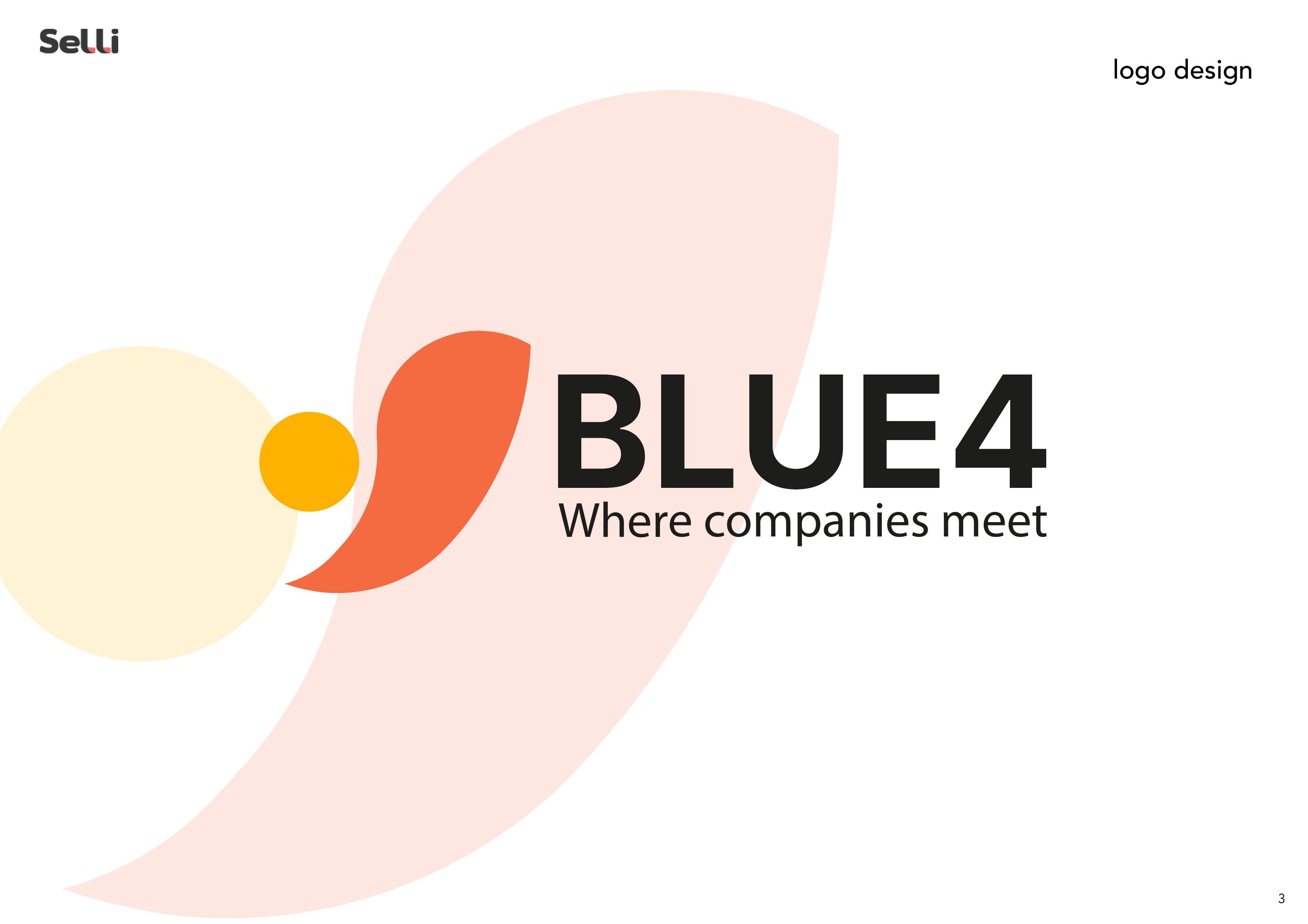
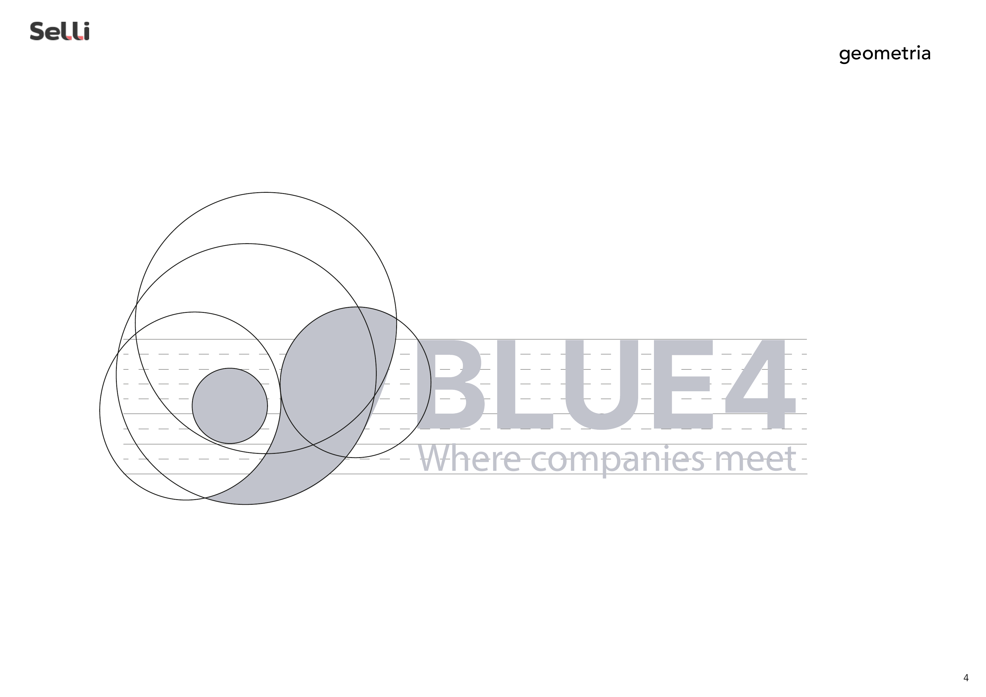
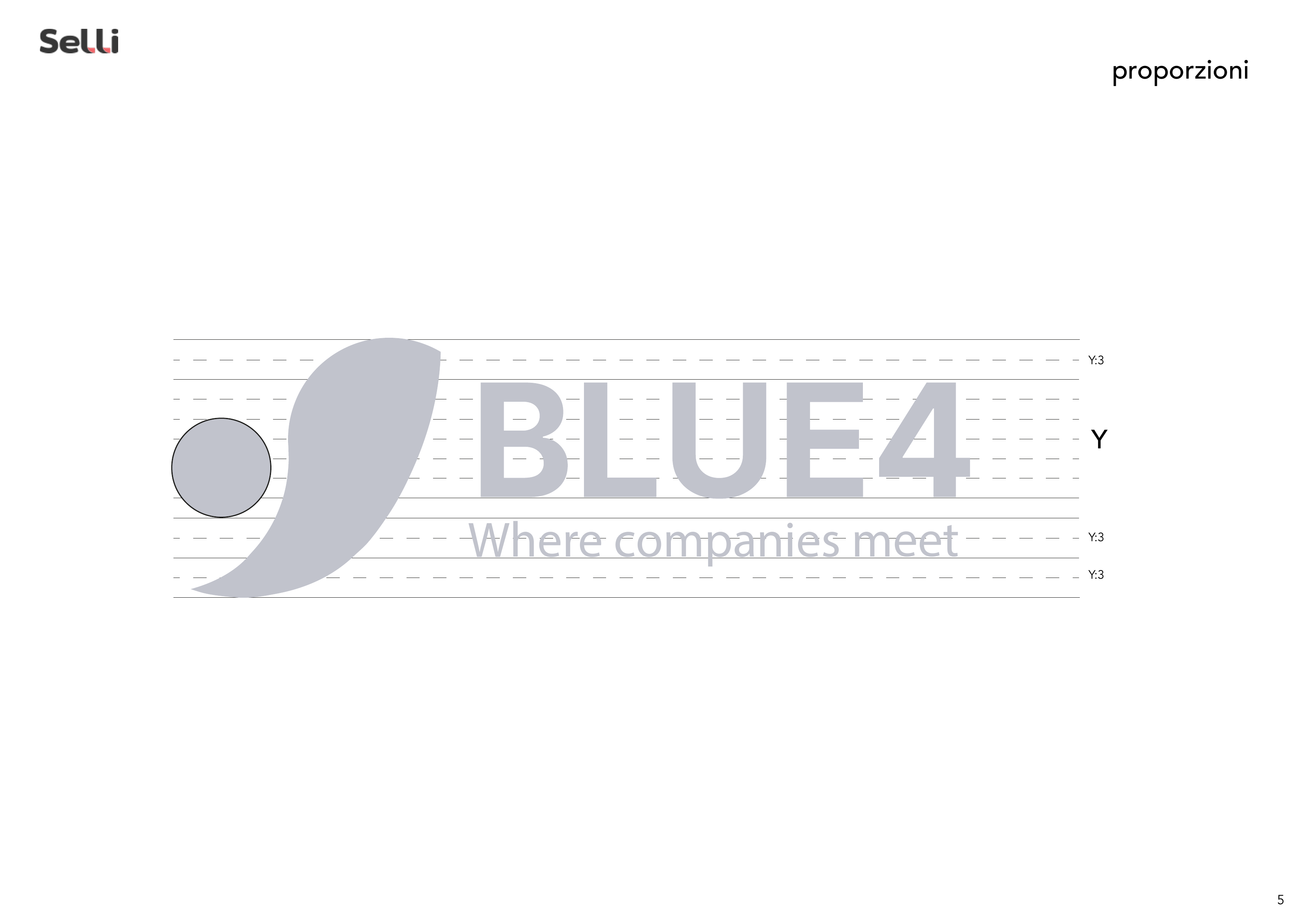
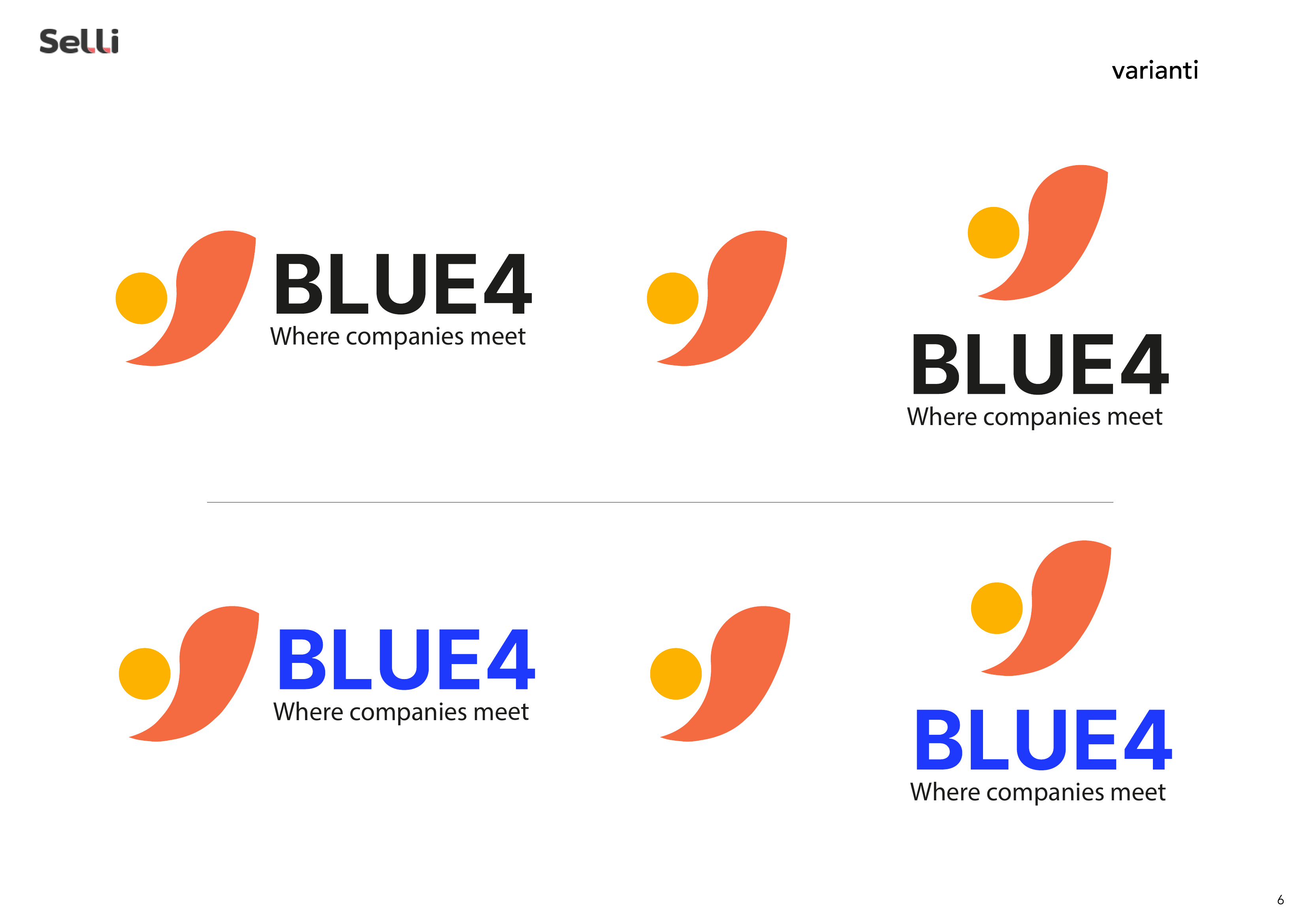
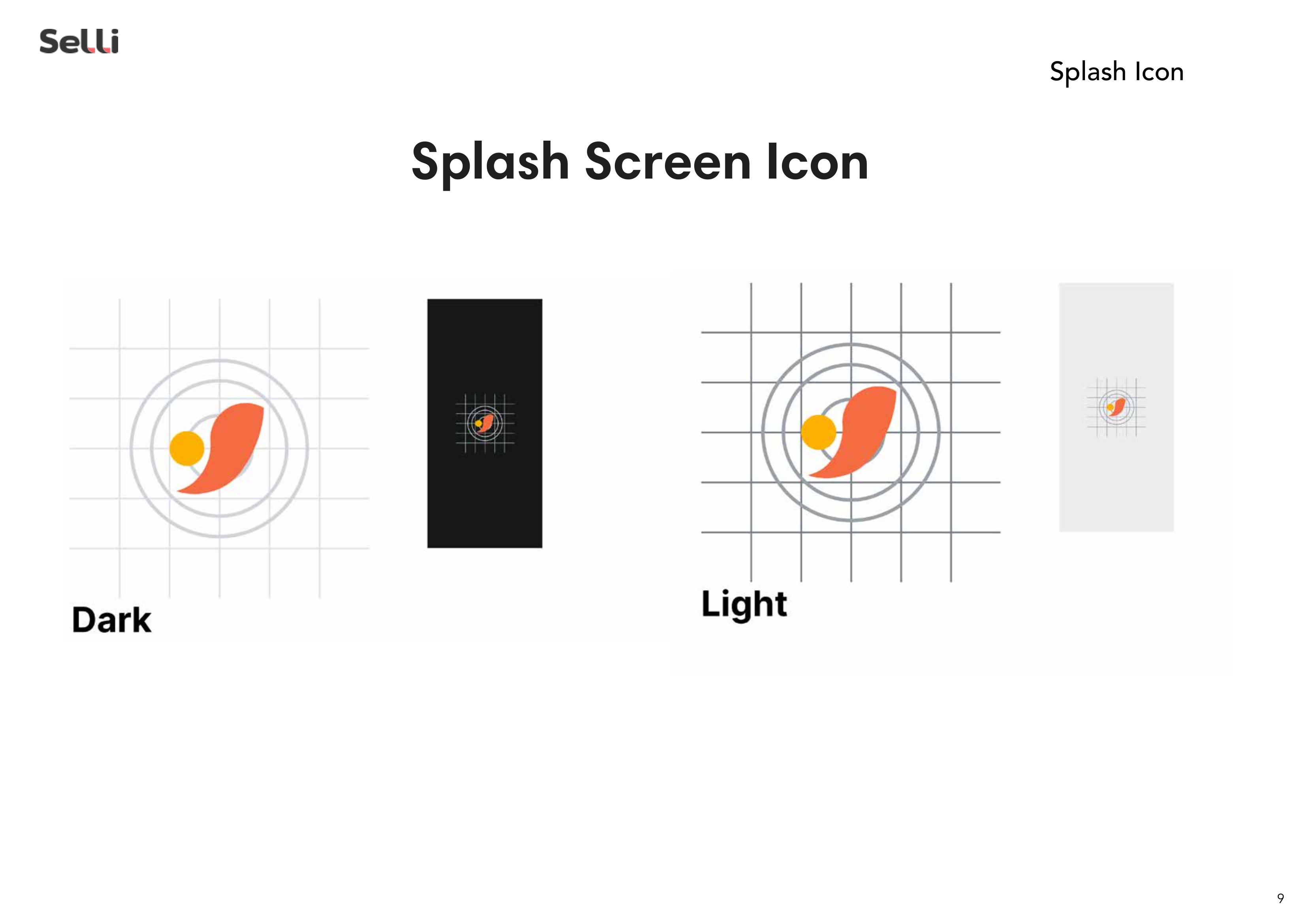
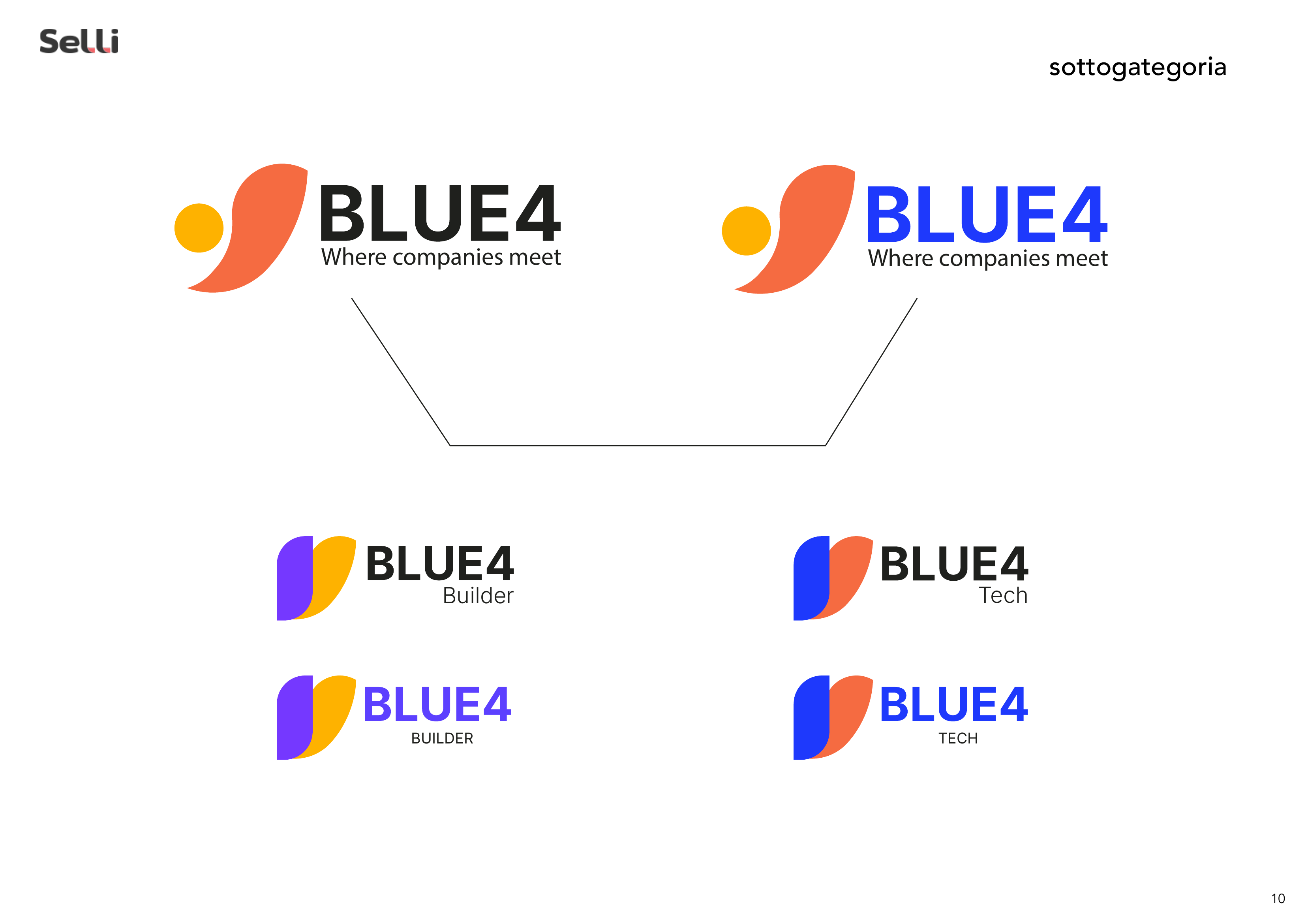
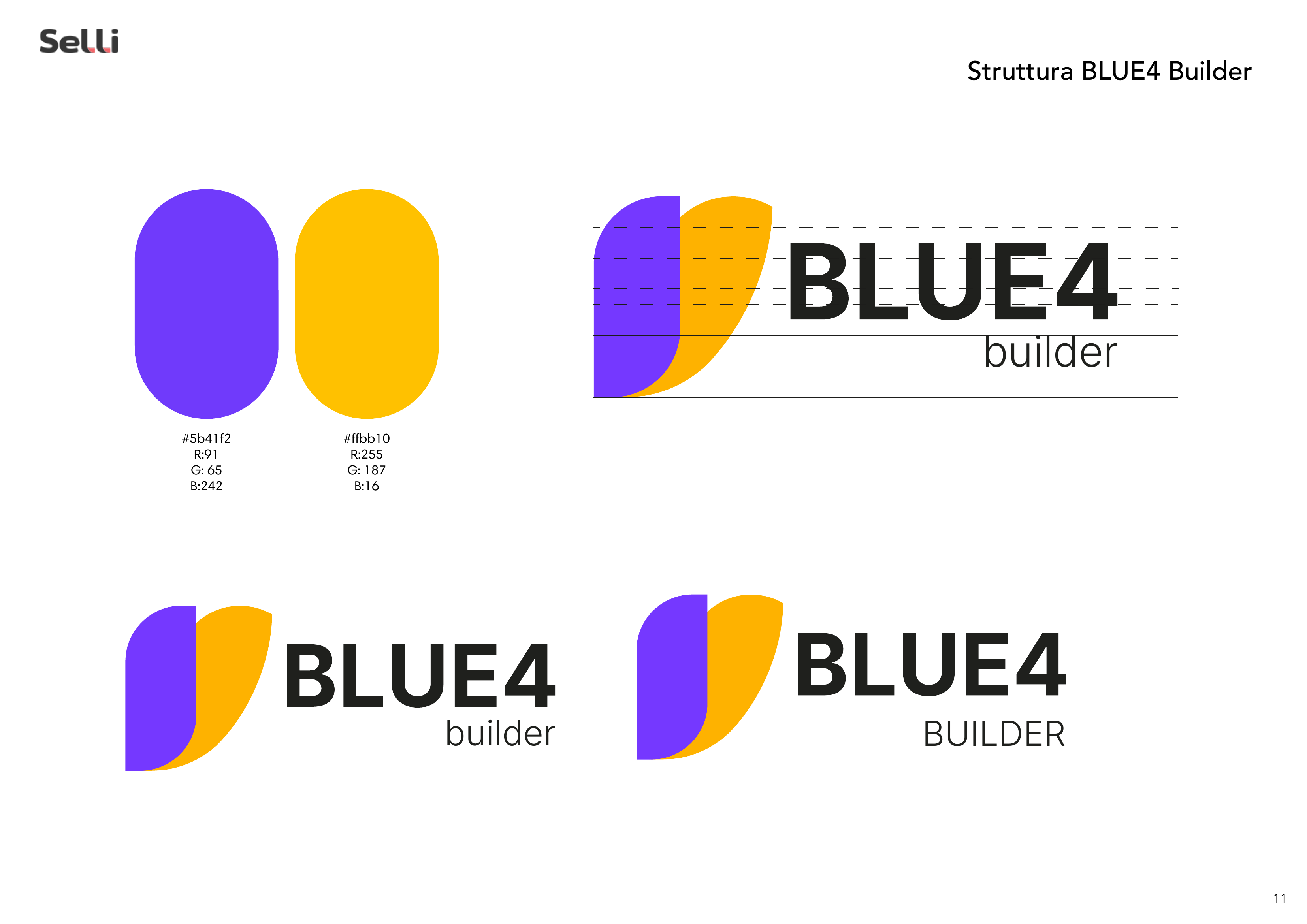
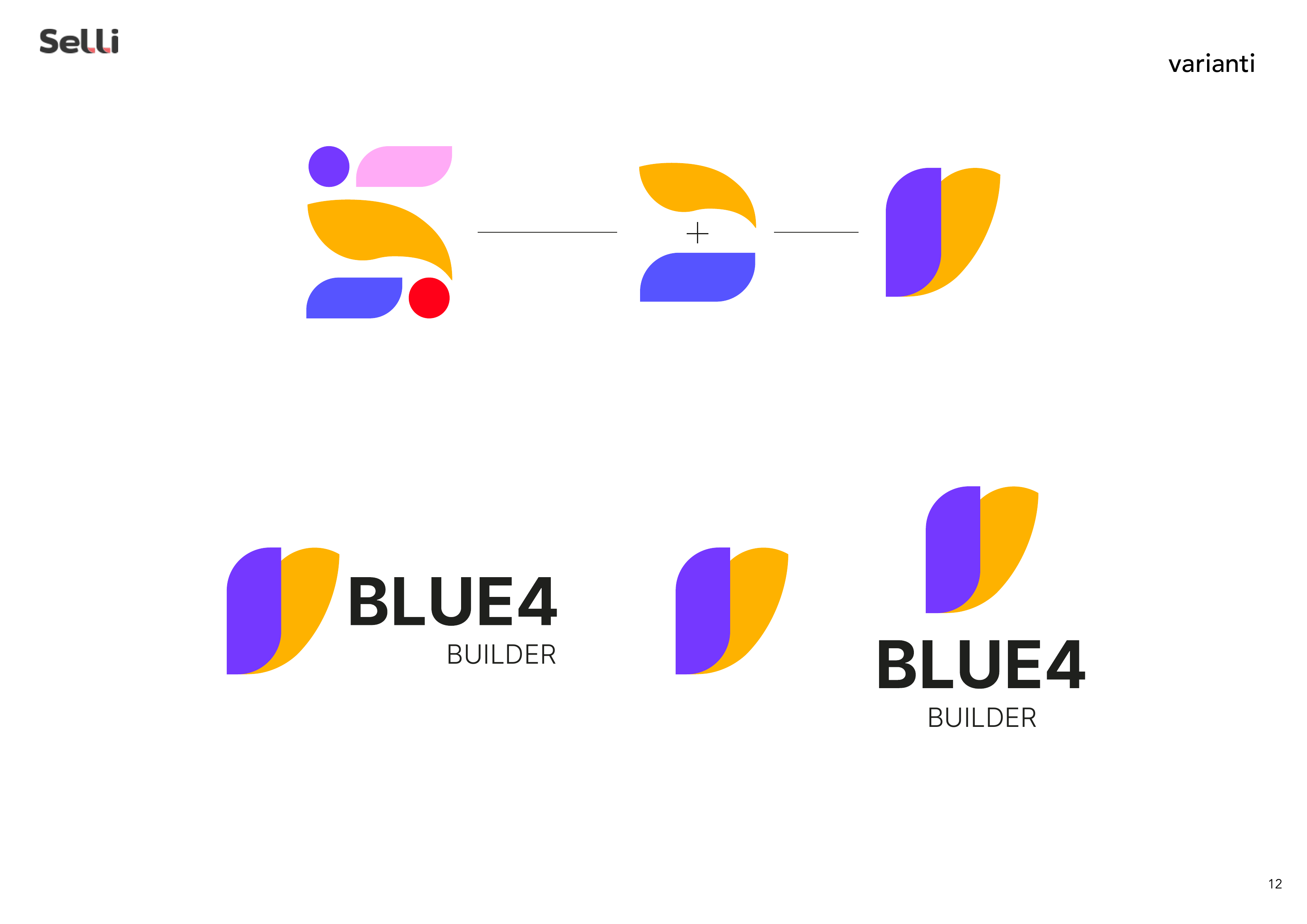
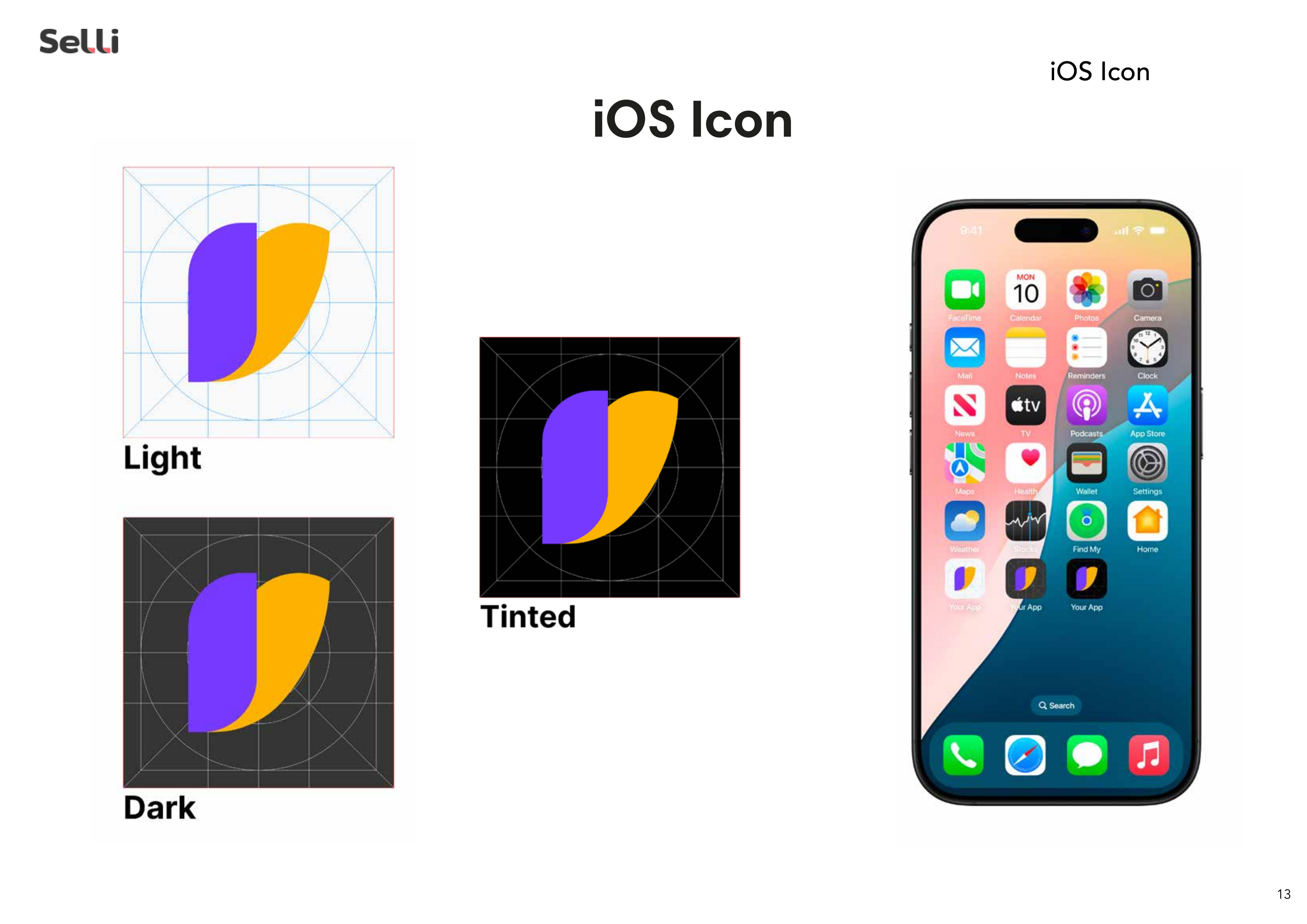
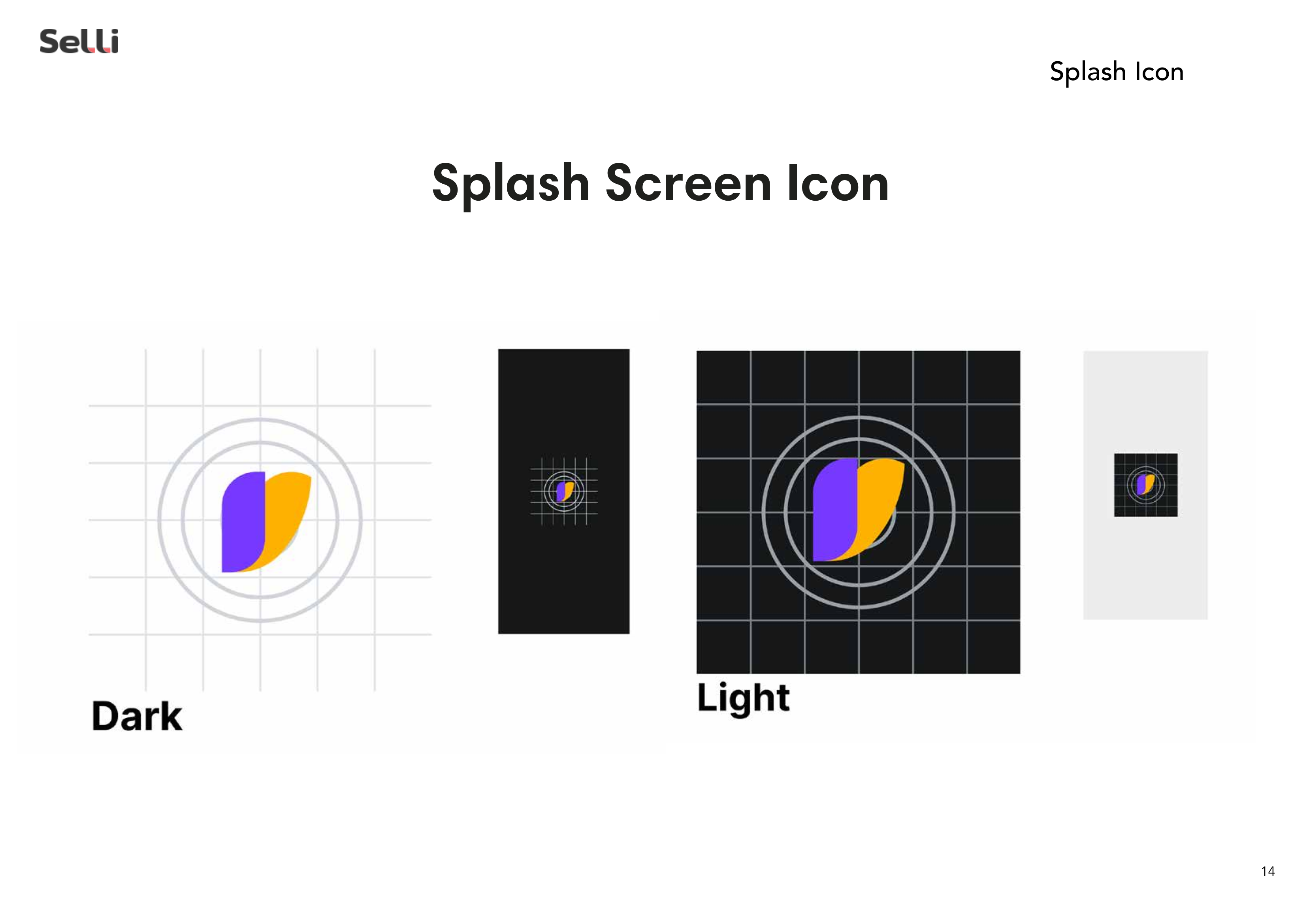
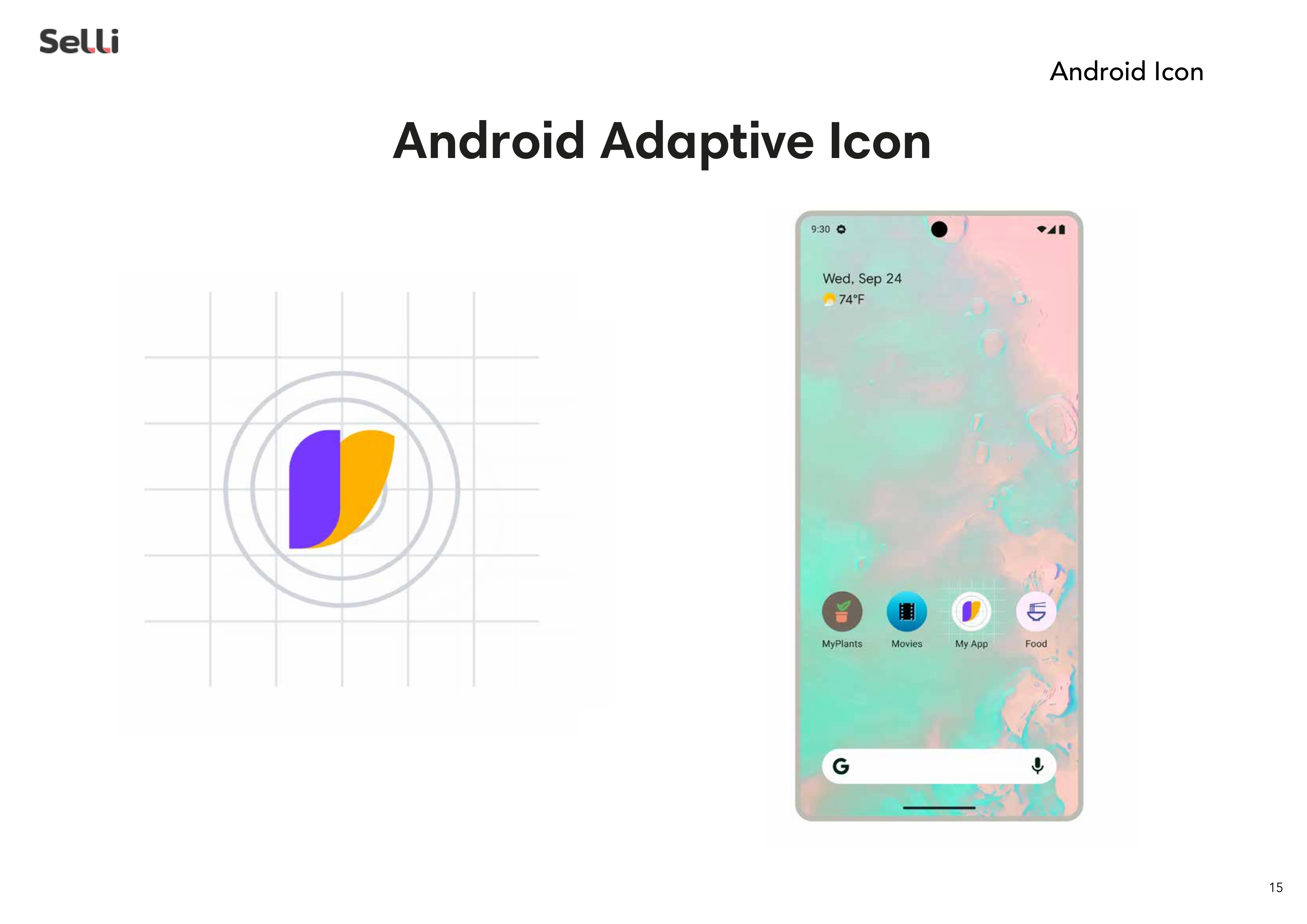
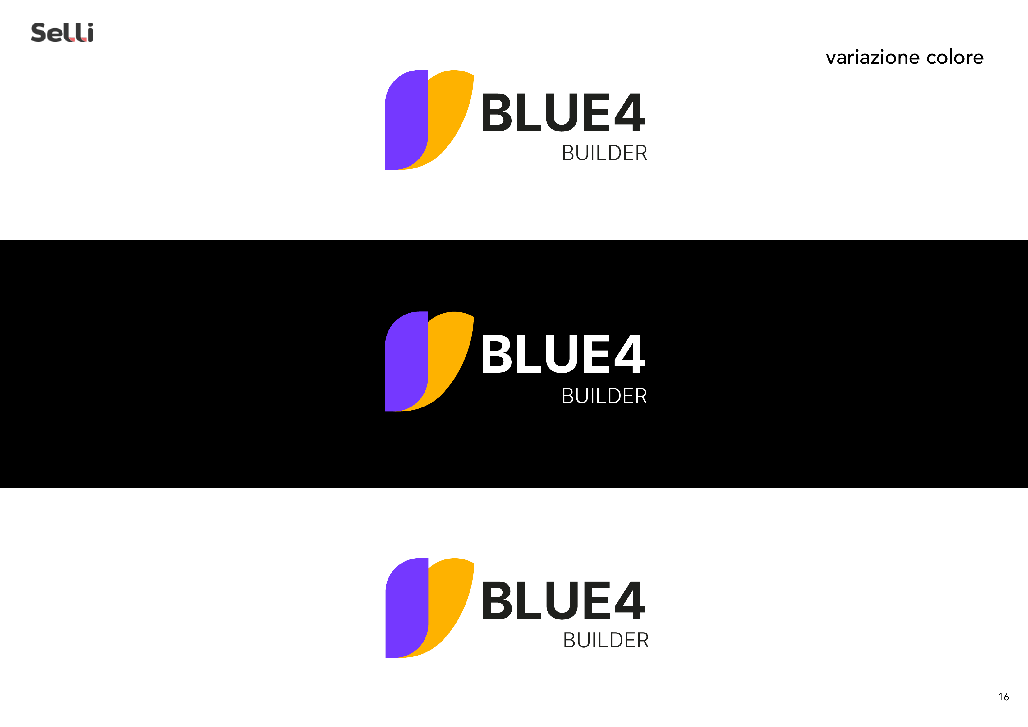
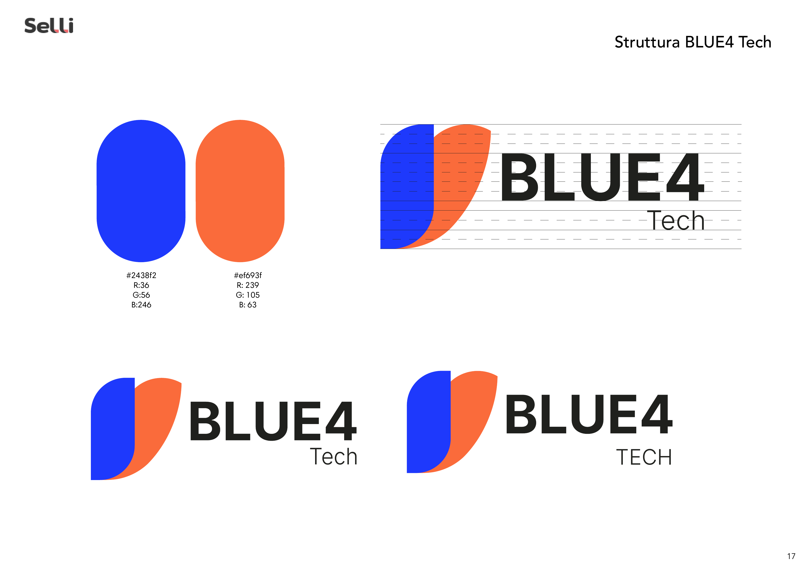
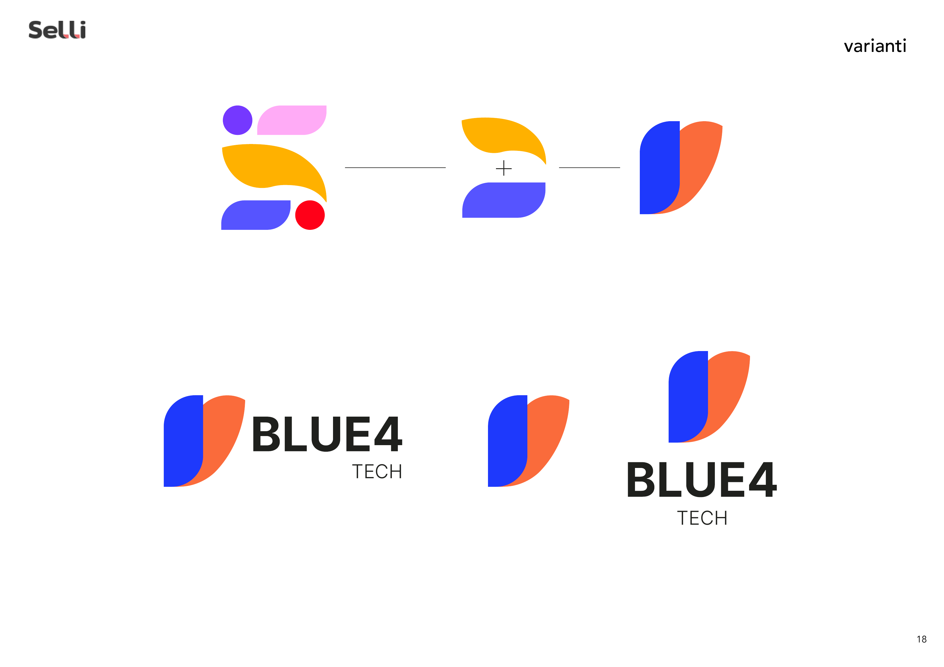
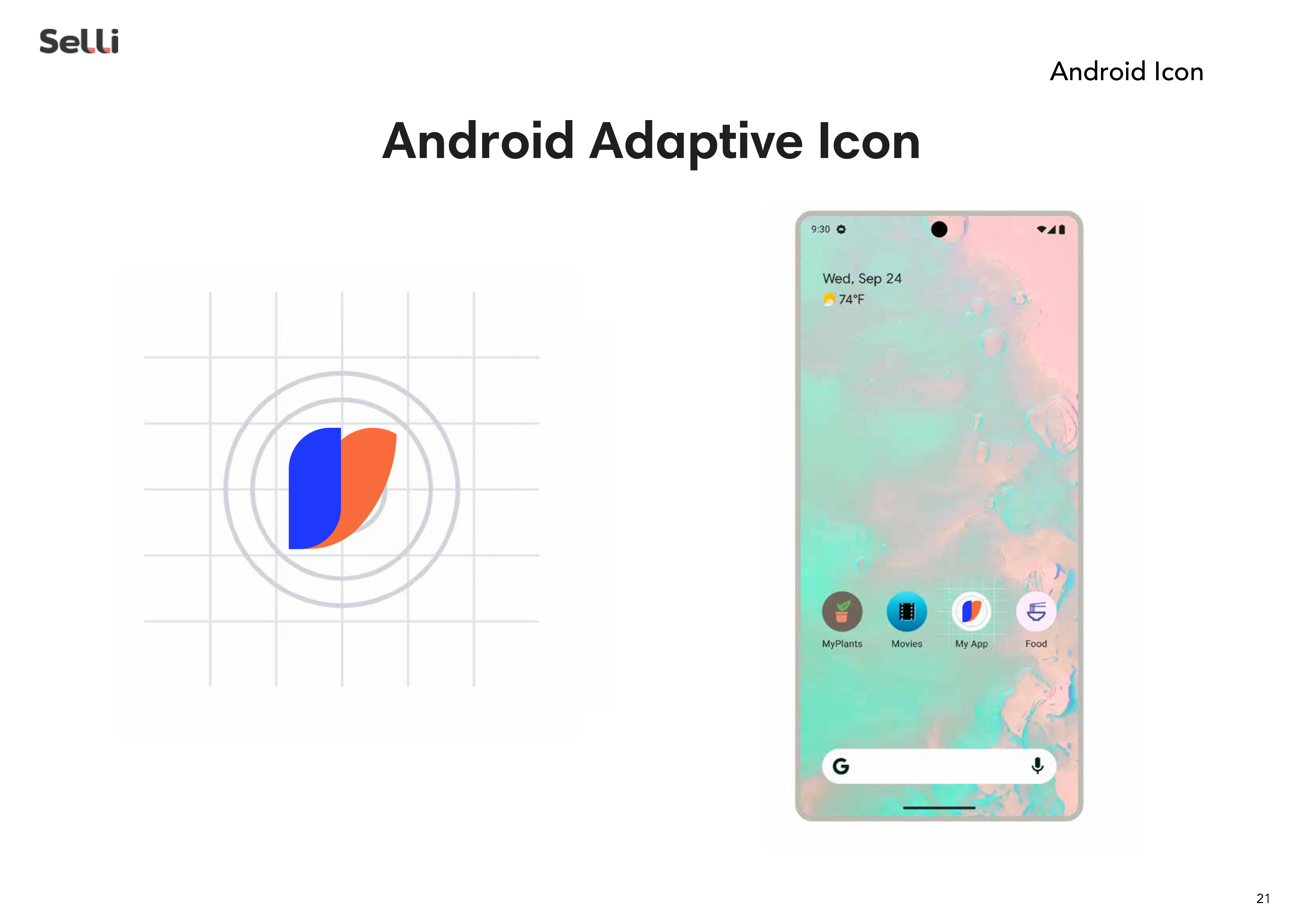
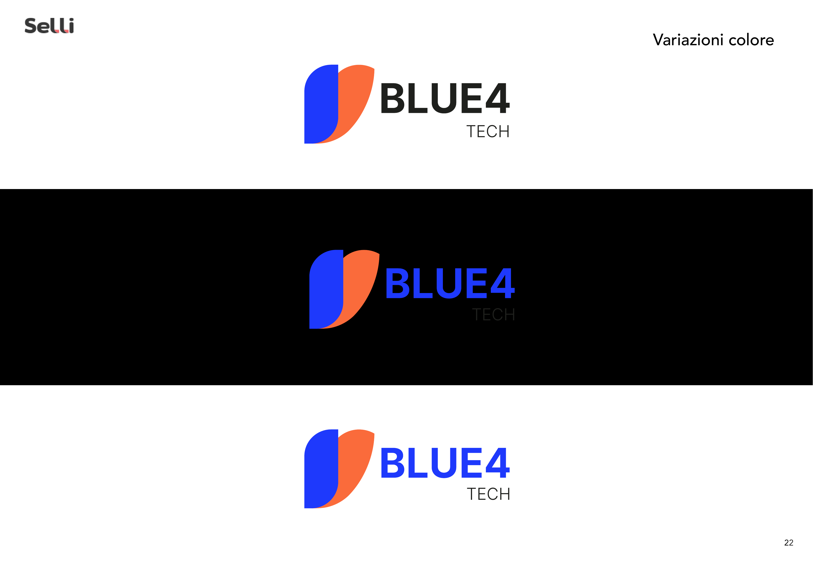
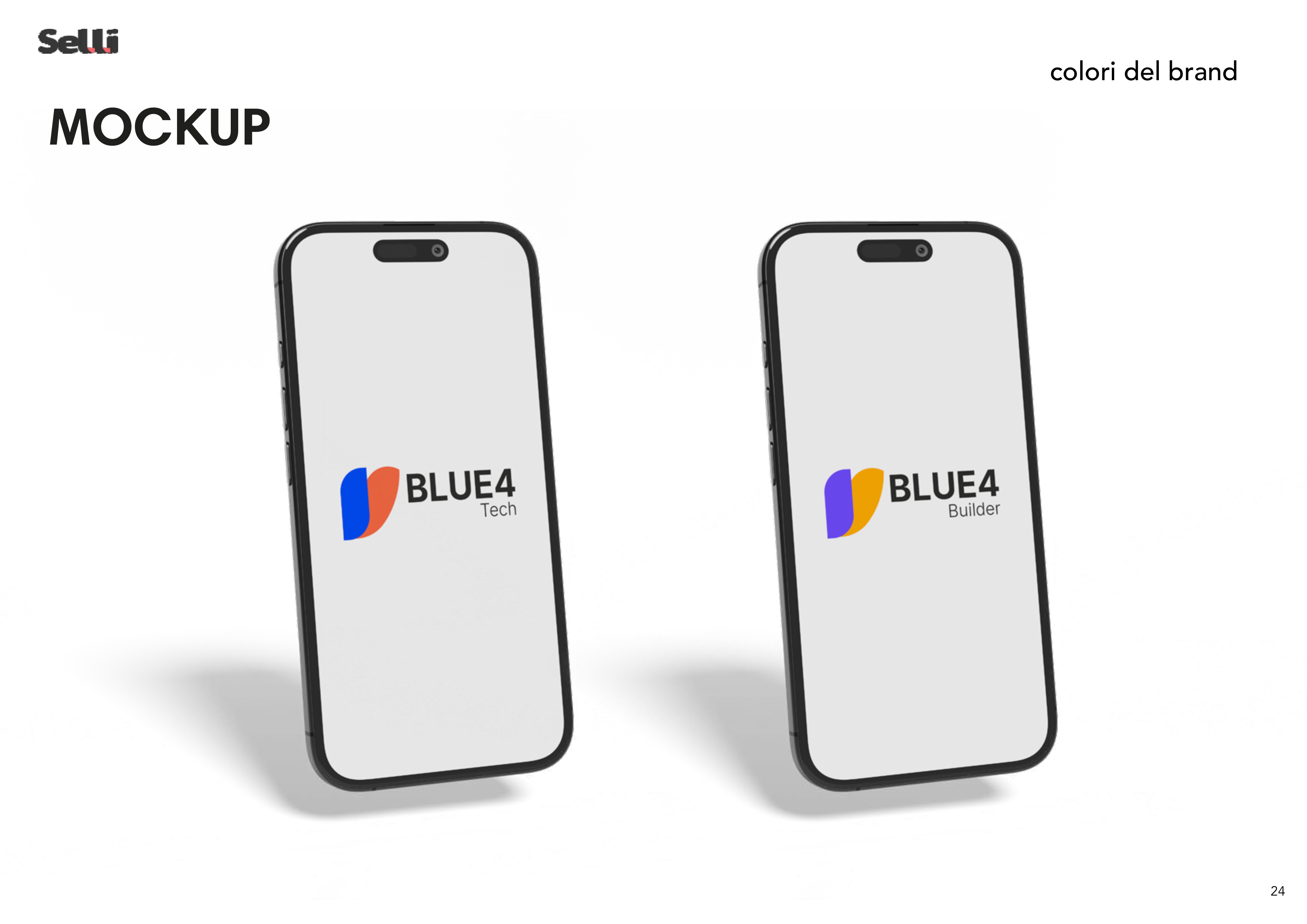
→ Logo Design: Abstract, organic icon composed of fluid shapes — a dark enveloping element, a coral-orange "wing" form, and a golden accent dot — evoking connection and convergence. Clean logotype in bold condensed sans-serif.
→ Colour System: Primary palette of coral orange, gold yellow, and dark anthracite, derived from the Softy colour system but with a distinctive identity and emphasis.
→ Visual Language: Dark-first aesthetic with curvilinear fluid background shapes suggesting movement and meeting points. Premium, tech-oriented look.
→ Brand Architecture: Designed to function independently while maintaining a clear visual kinship with the parent brand Softy.
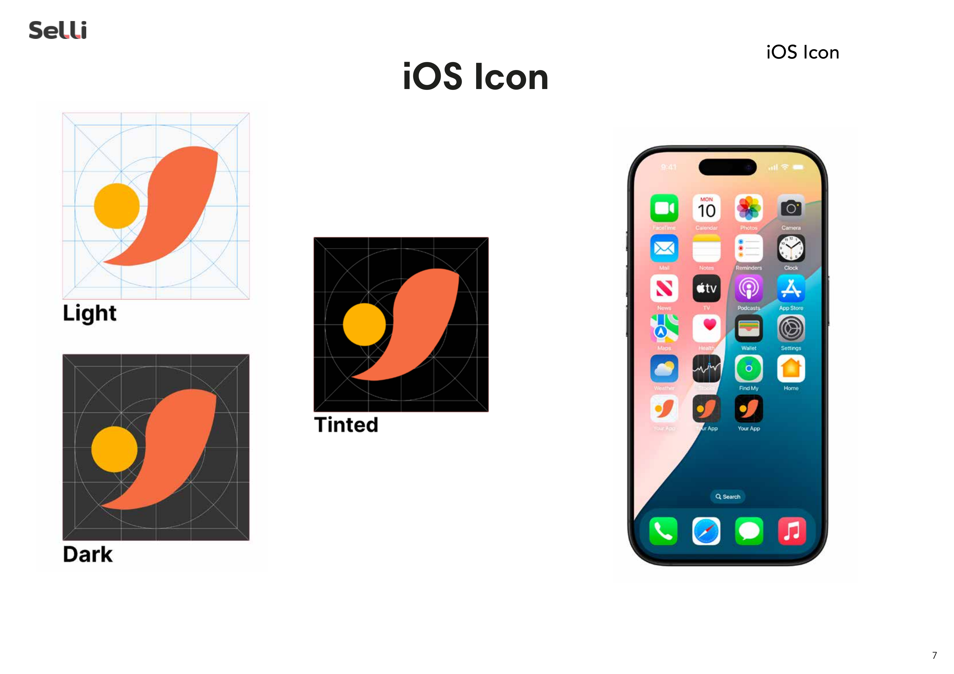
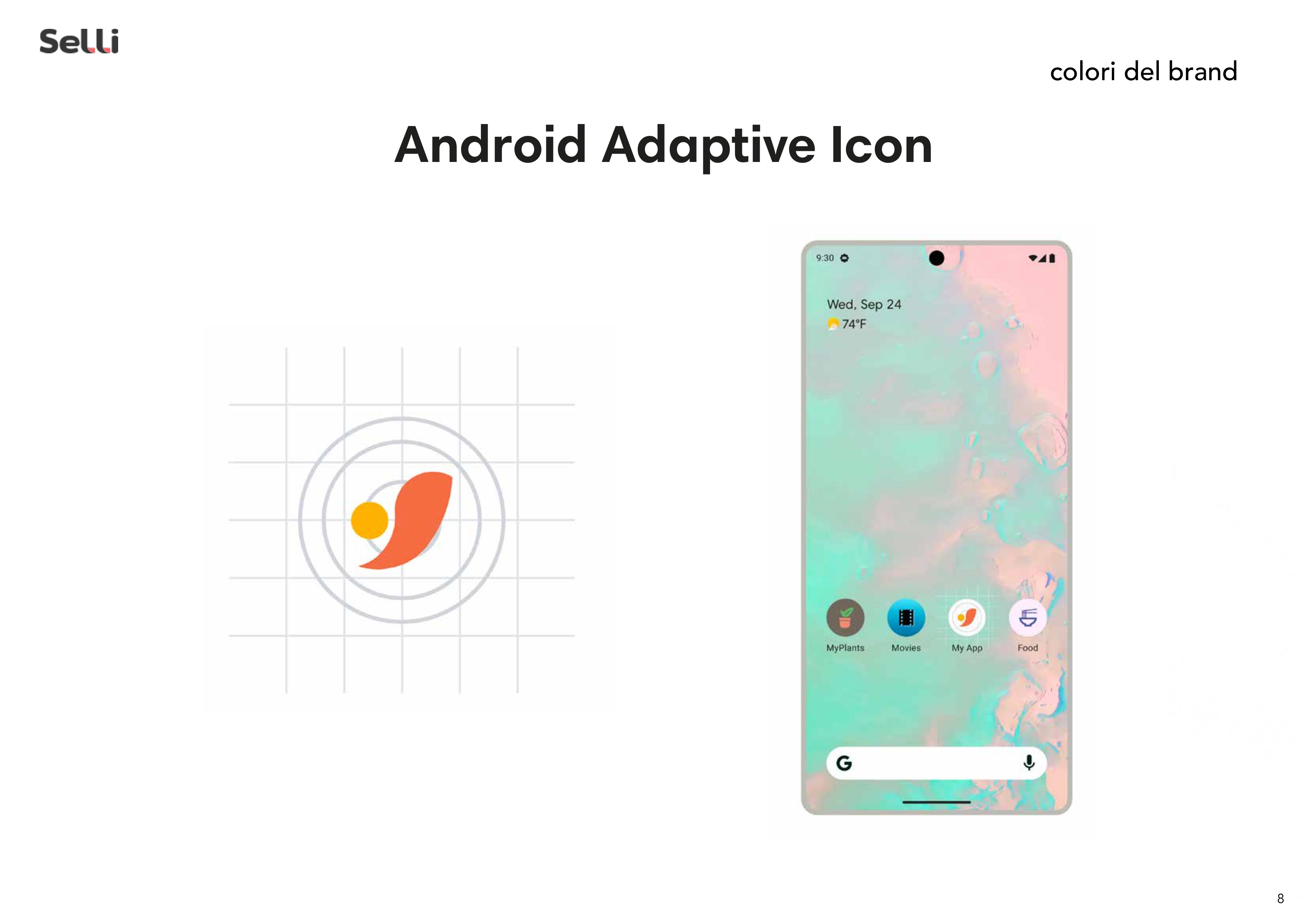
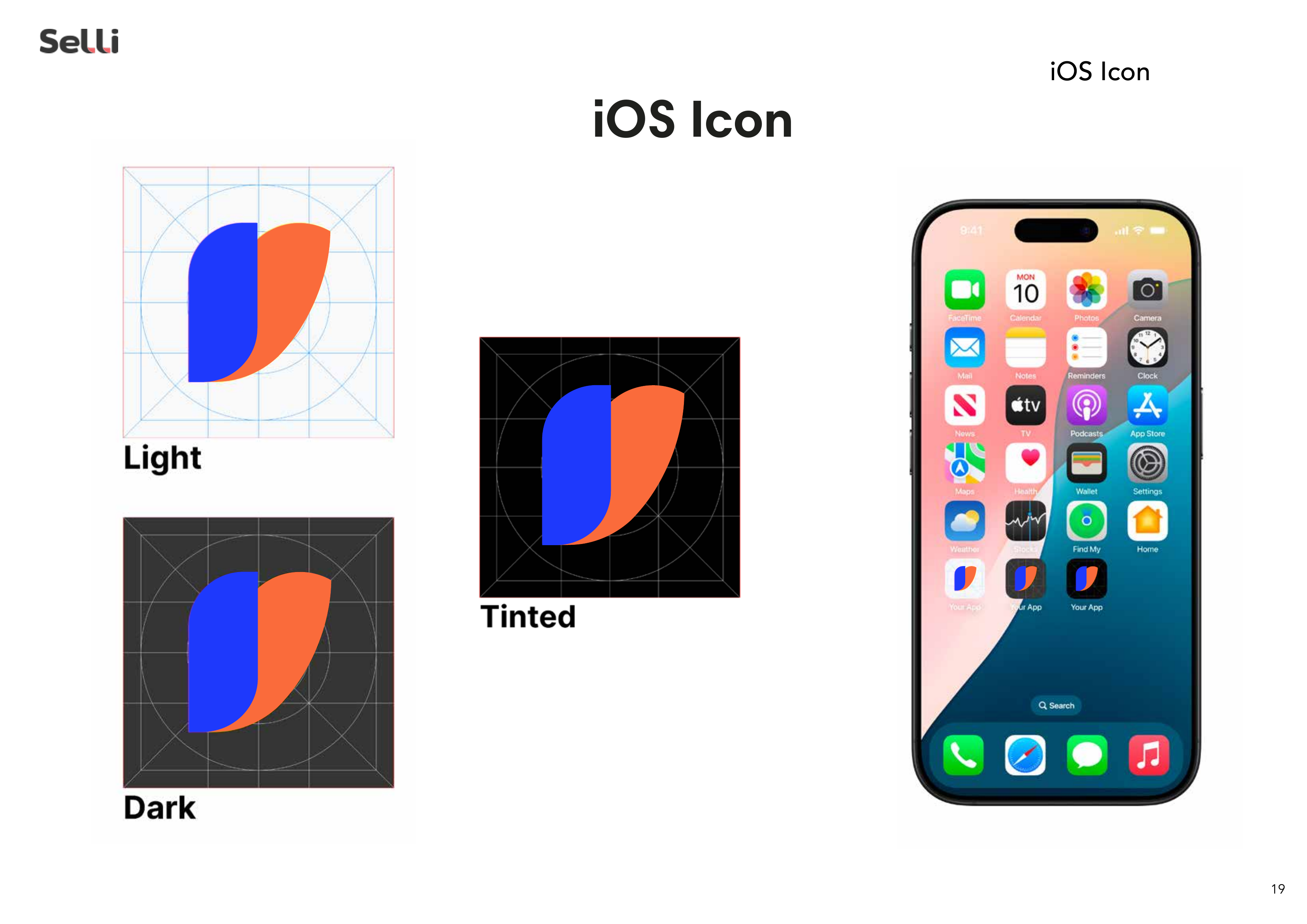
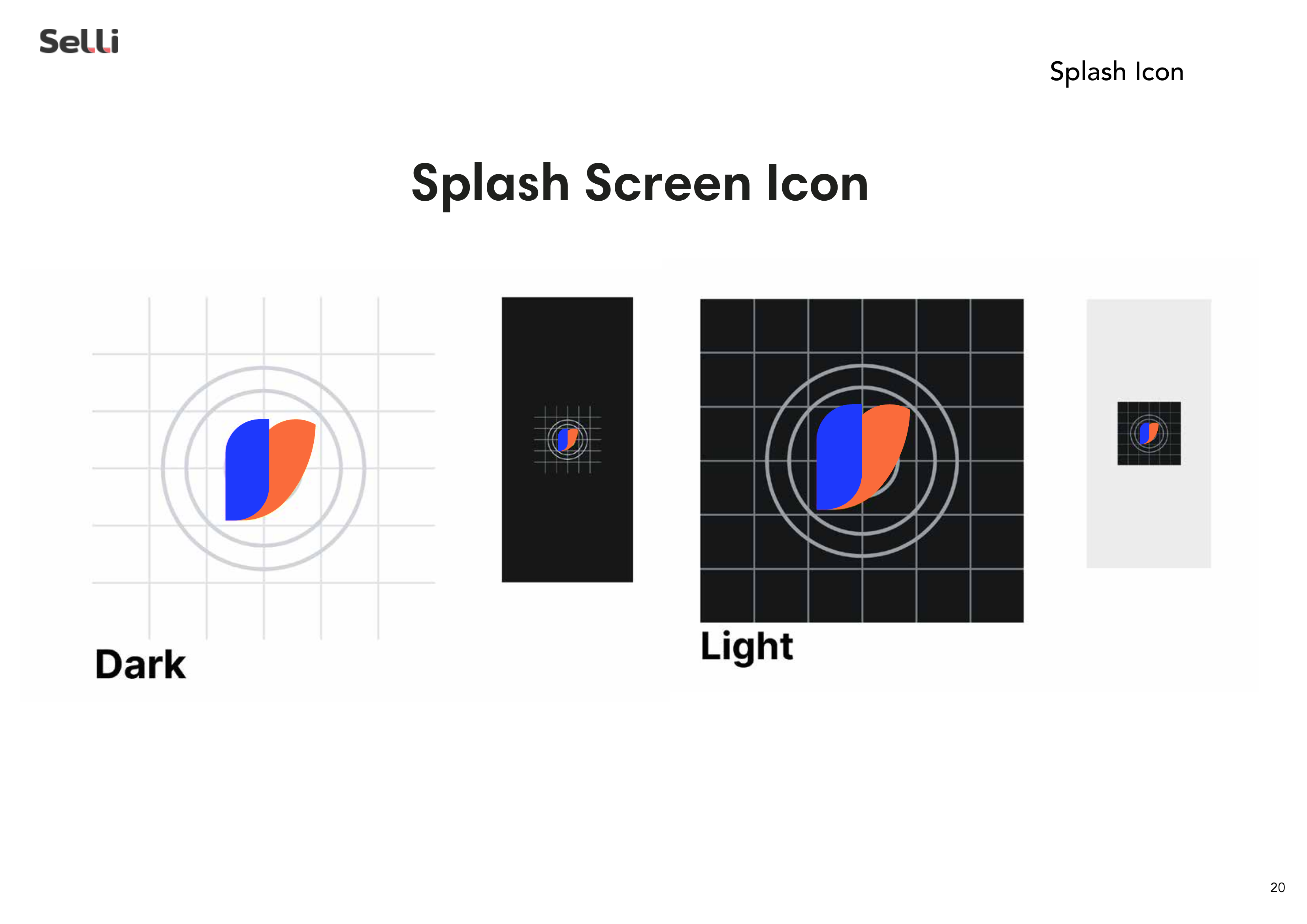
→ Complete Brand Book: 26-page guidelines covering logo construction, colour specifications, typography, and usage rules.
RESULTS
• Clear differentiation within a multi-brand ecosystem
• Professional identity that builds trust with the B2B audience
• Consistent visual system from digital platform to marketing materials
Project Gallery

Want similar results?
Every business is different, but efficiency problems often look alike. Let's talk about how we can solve yours.