M.T. Mohr: Brand Identity for a Historic Precious Stones Maison
A brand identity project designed to reinterpret the heritage of a historic precious stones maison founded in 1921. The goal was to modernize the brand image while preserving its authority, expressing tradition, artisan mastery, and understated luxury.
The Challenge
A historic precious stones maison, with over 100 years of activity, needed an identity refresh capable of enhancing its heritage without losing relevance in the contemporary luxury market.
The brand had to communicate tradition, artisan mastery, and understated authority.
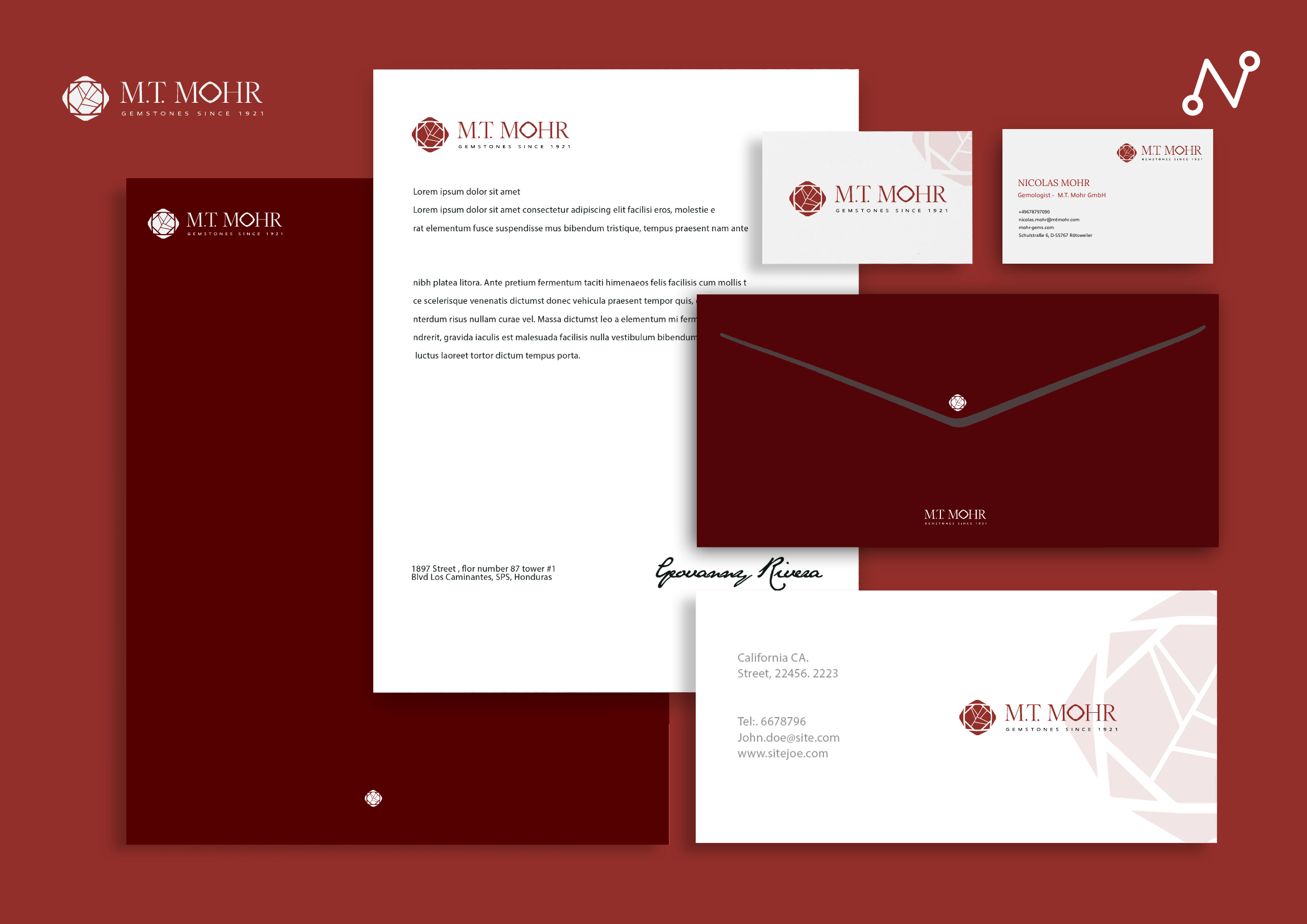
The Solution
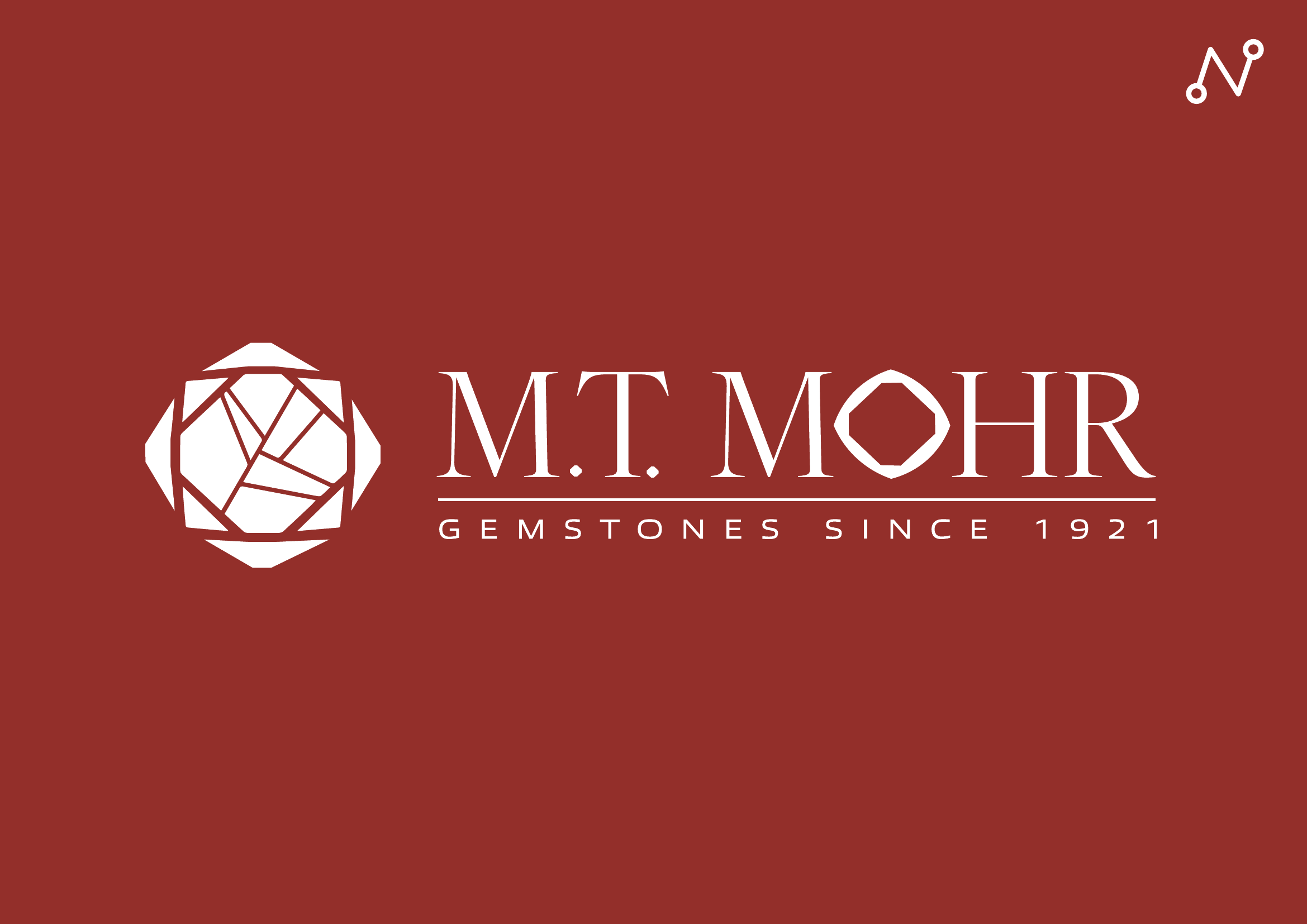
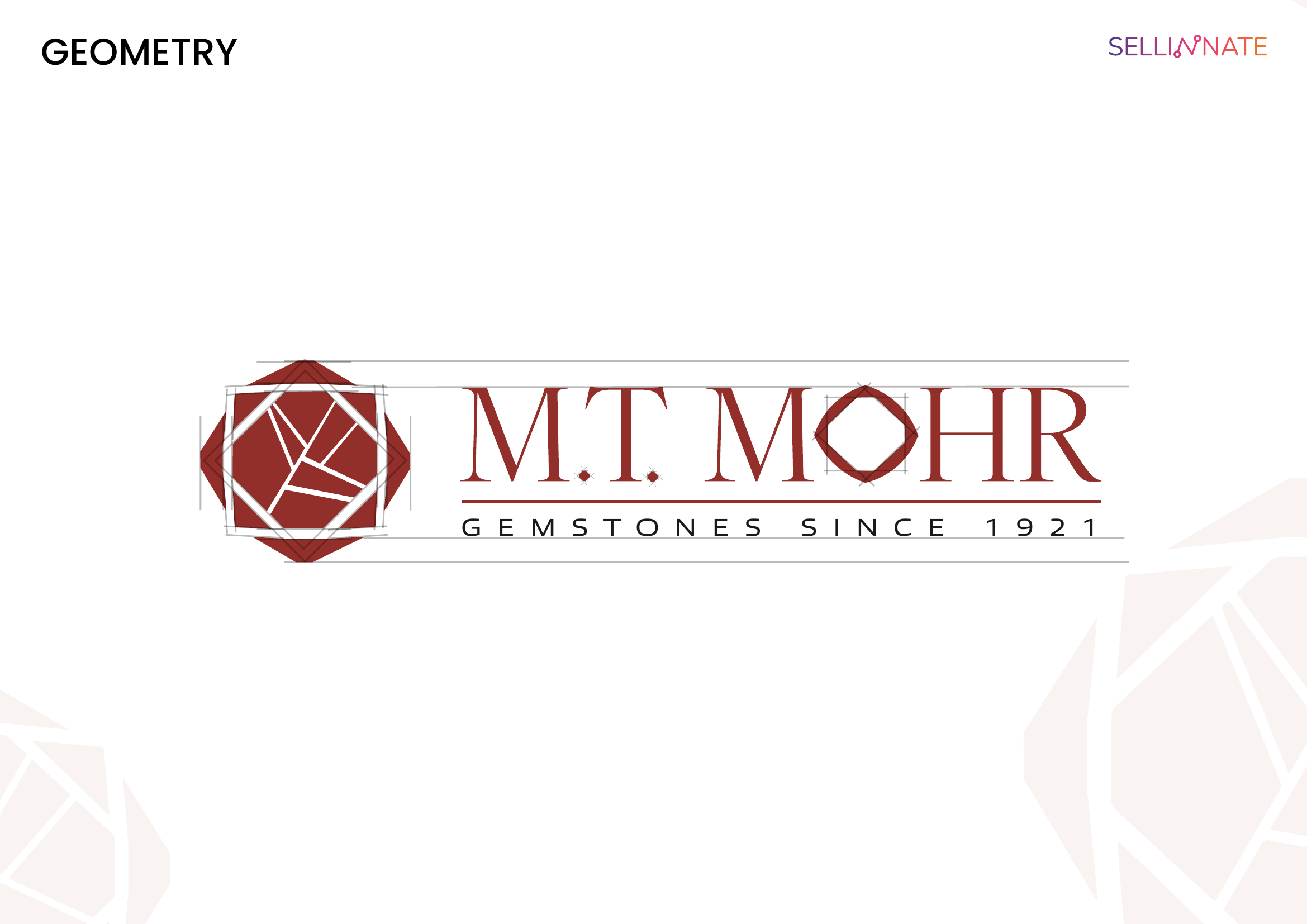
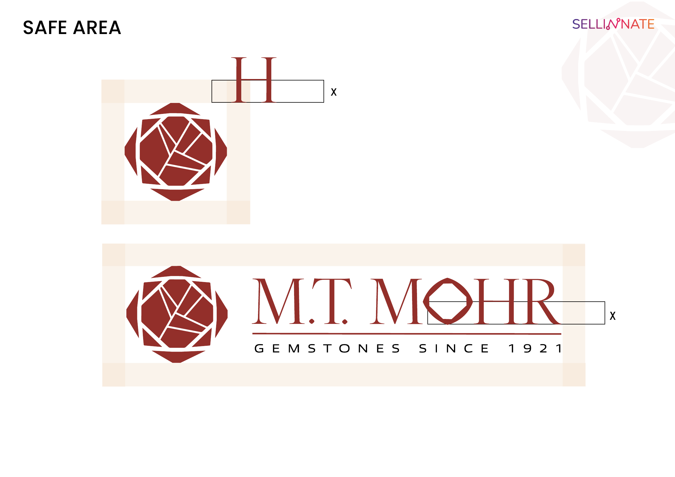
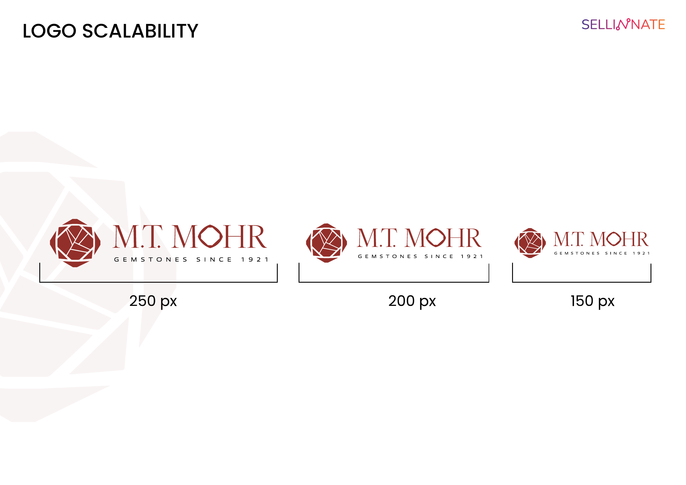
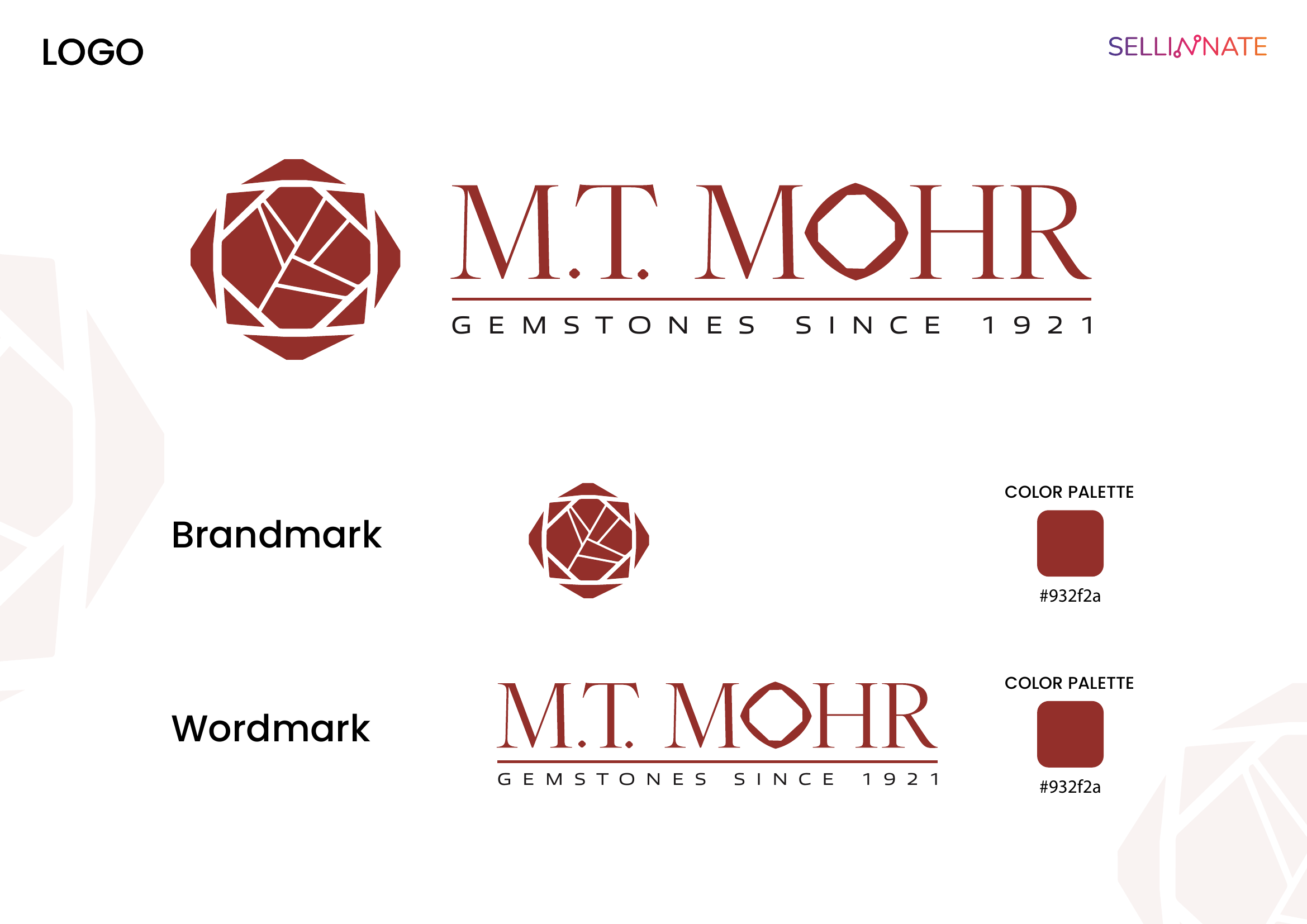
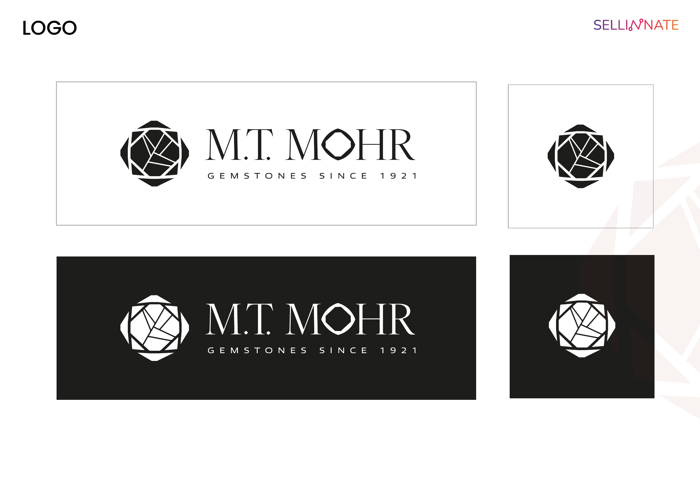
→ Logo Design: Geometric icon inspired by a rose-cut gemstone, featuring detailed facet lines, enclosed in overlapping and rotated rhomboidal shapes. The "O" in MOHR is replaced by a hexagonal gem — a distinctive, recognizable brand element. High-contrast serif wordmark evoking classic luxury.
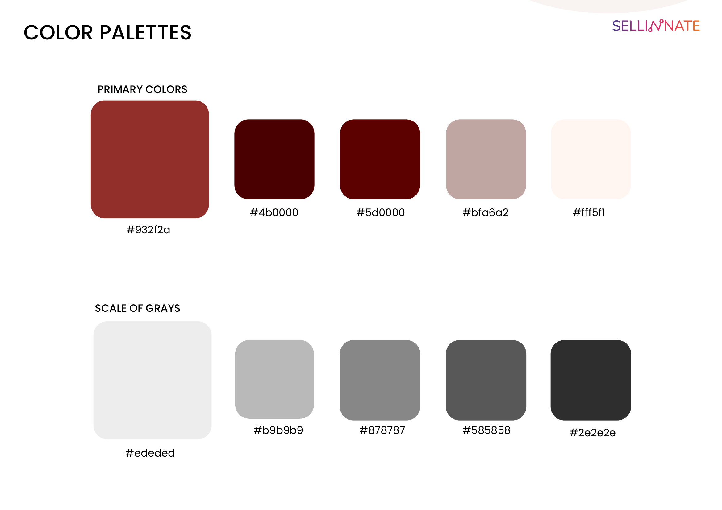
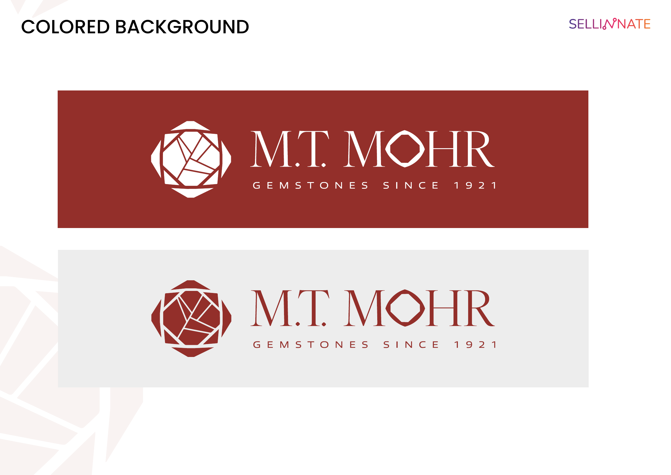
→ Colour System: Burgundy / brick red as the sole brand colour — intense, warm, and strongly identitarian. Recalls rubies and garnets, in perfect harmony with the precious stones sector.
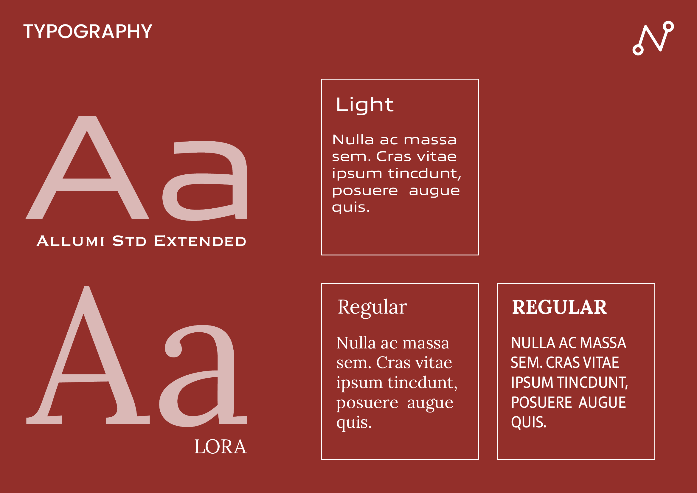
→ Typography: Didone-style serif for the logotype (fine hairlines and bold strokes), with widely spaced uppercase tagline — elegant and refined.
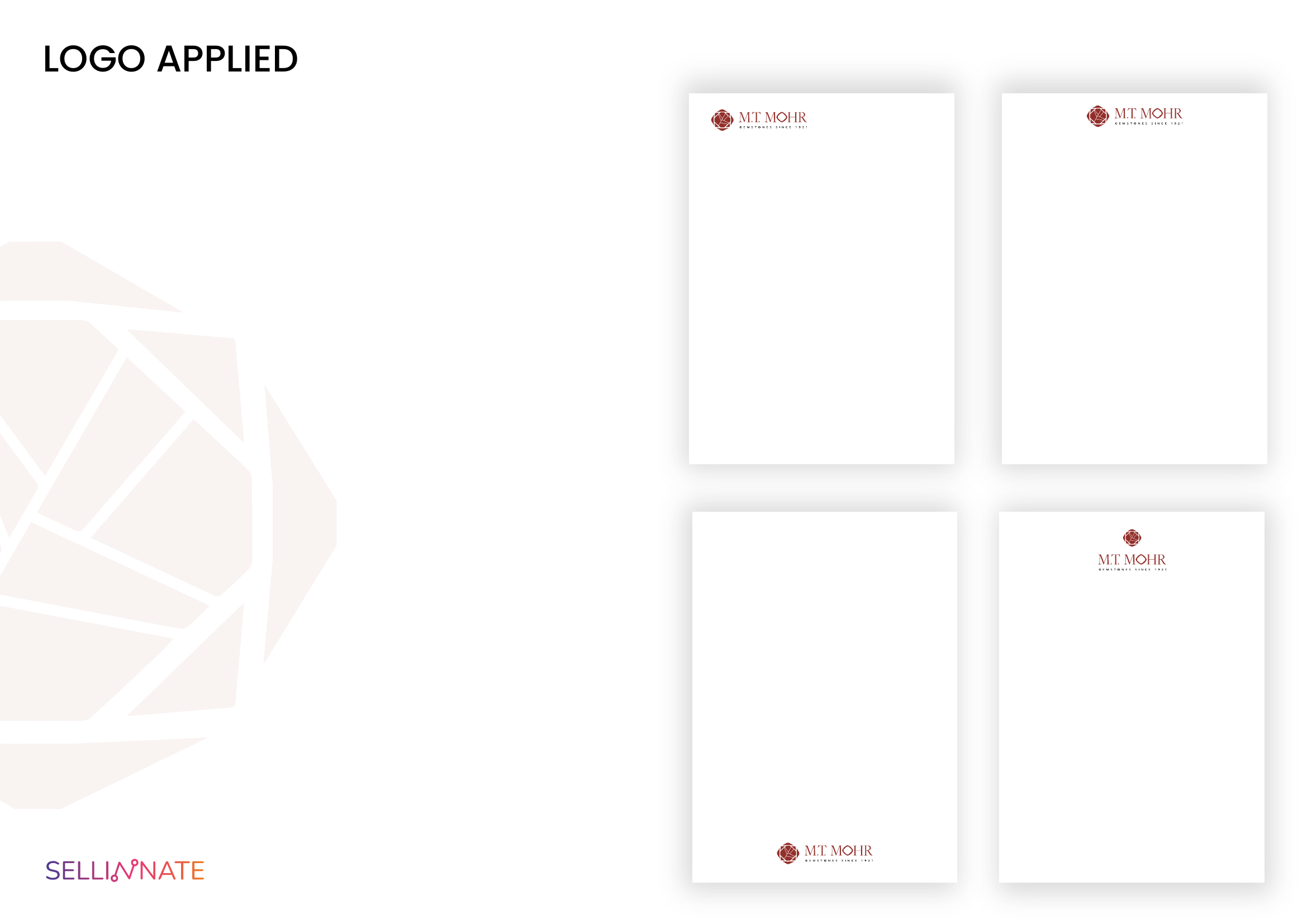
→ Visual Language: The faceted gem motif becomes a large-scale watermark pattern, creating visual depth across applications. Minimalist layouts with generous white space convey understated sophistication.
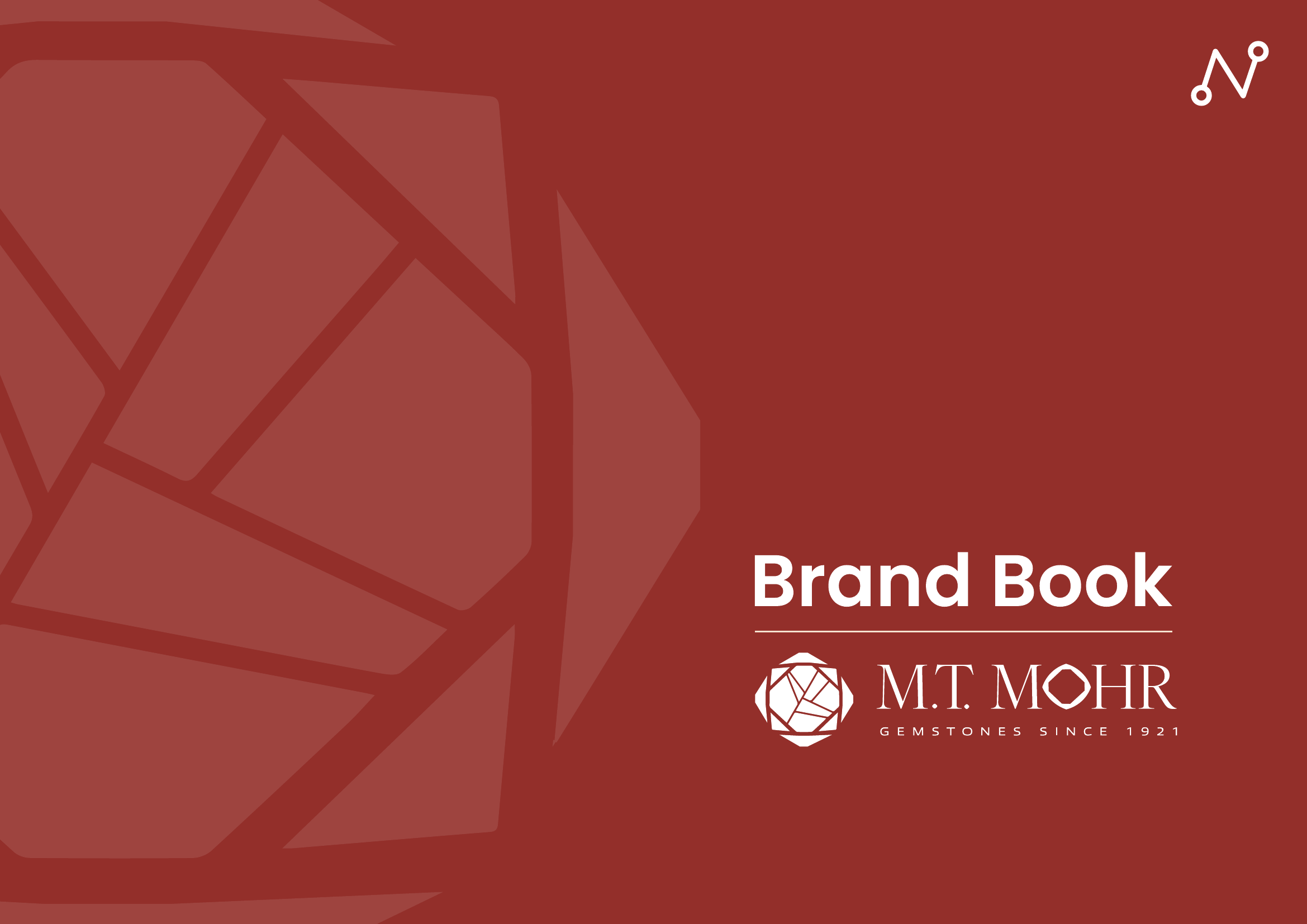
→ Complete Brand Book: 15-page bilingual (English) guidelines with grid construction, proportional systems, and usage specifications.
RESULTS
• Modernization of a historic brand without compromising its identity
• Monochromatic system ensuring elegance and consistency
• Gem motif as an instantly recognizable visual signature
Project Gallery
Want similar results?
Every business is different, but efficiency problems often look alike. Let's talk about how we can solve yours.