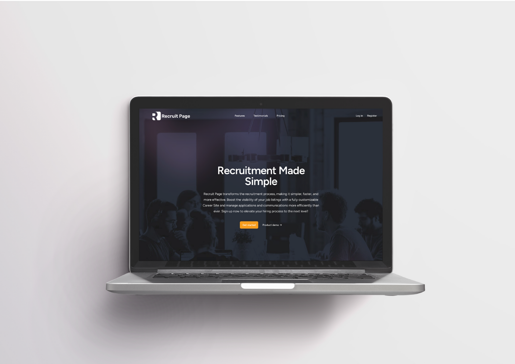
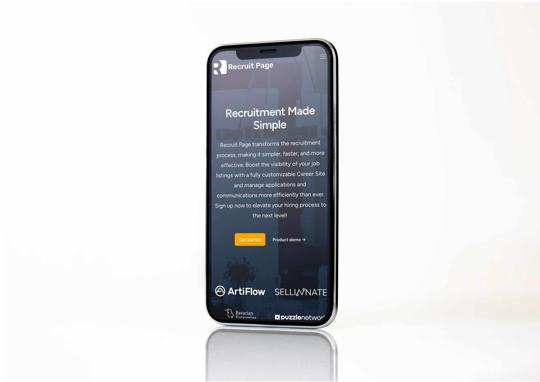
Recruit Page: Brand Identity for an HR Tech Platform
Brand identity for an HR Tech platform, designed to communicate energy, innovation, and accessibility in the digital recruitment sector.
The Challenge
A new HR Tech platform needed a modern, energetic visual identity capable of standing out in a highly competitive sector. The brand had to communicate optimism, action, and dynamism, addressing both recruiters and candidates.
The Solution
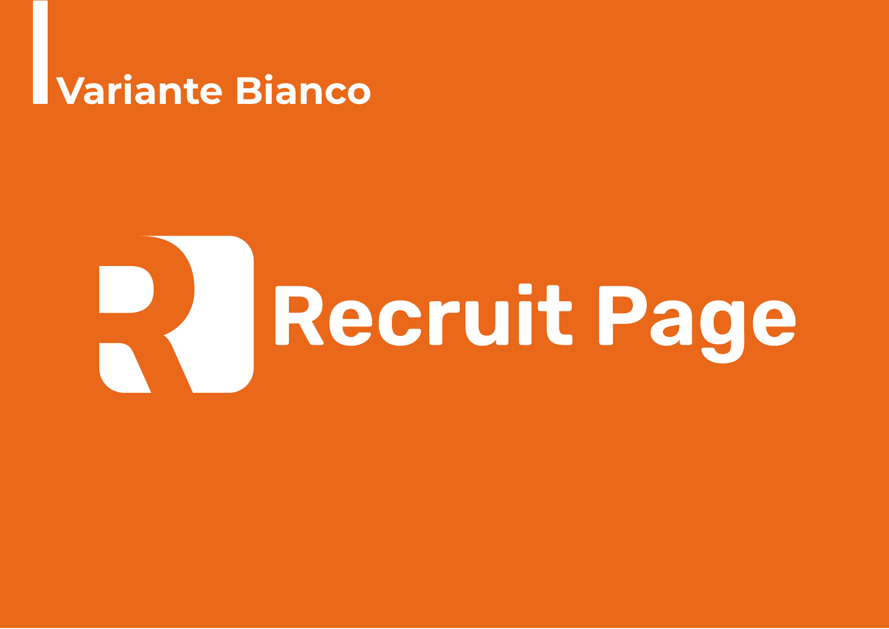
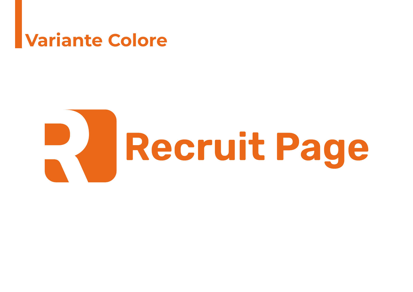
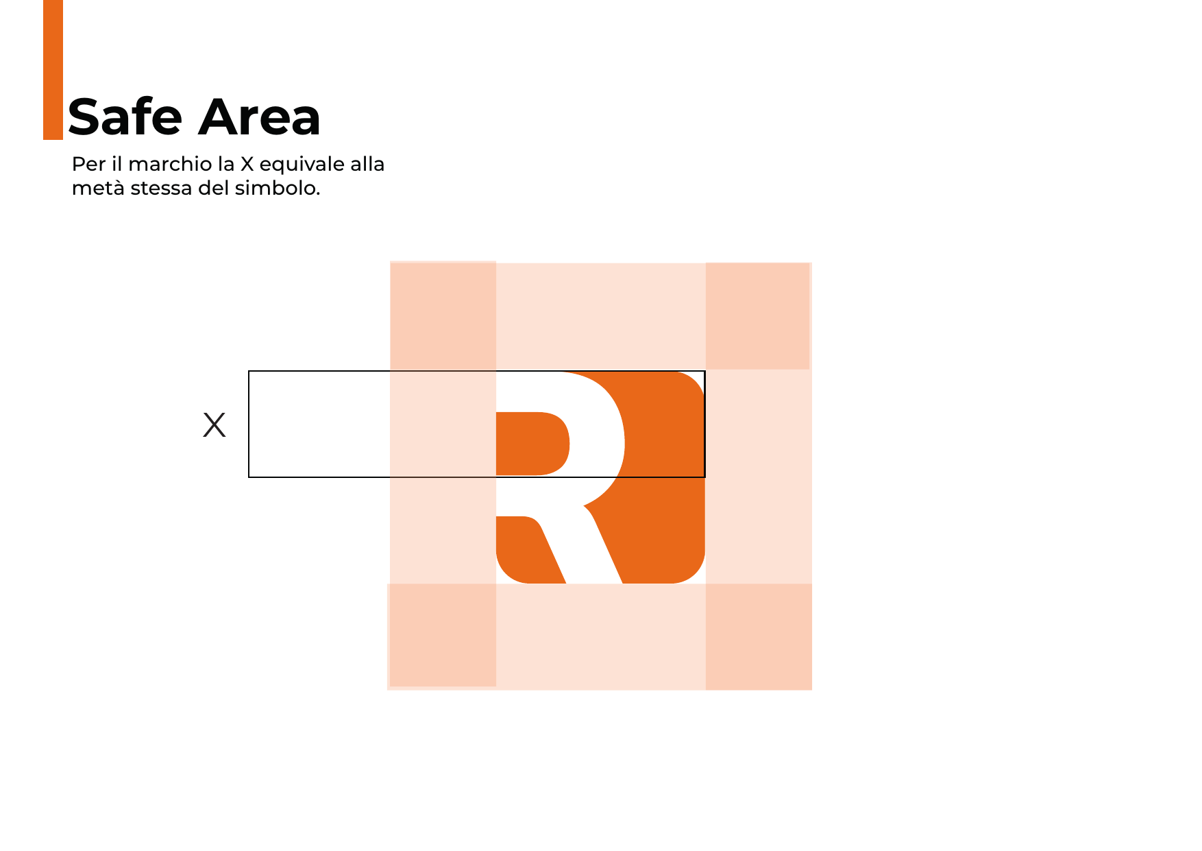
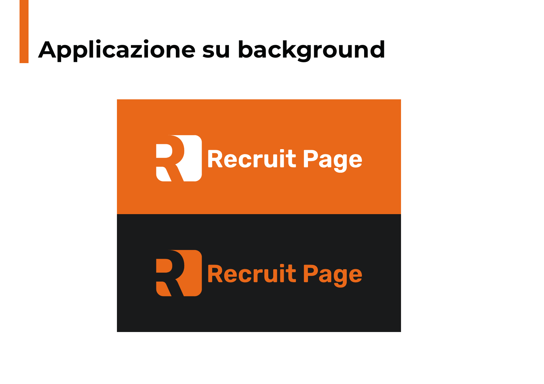
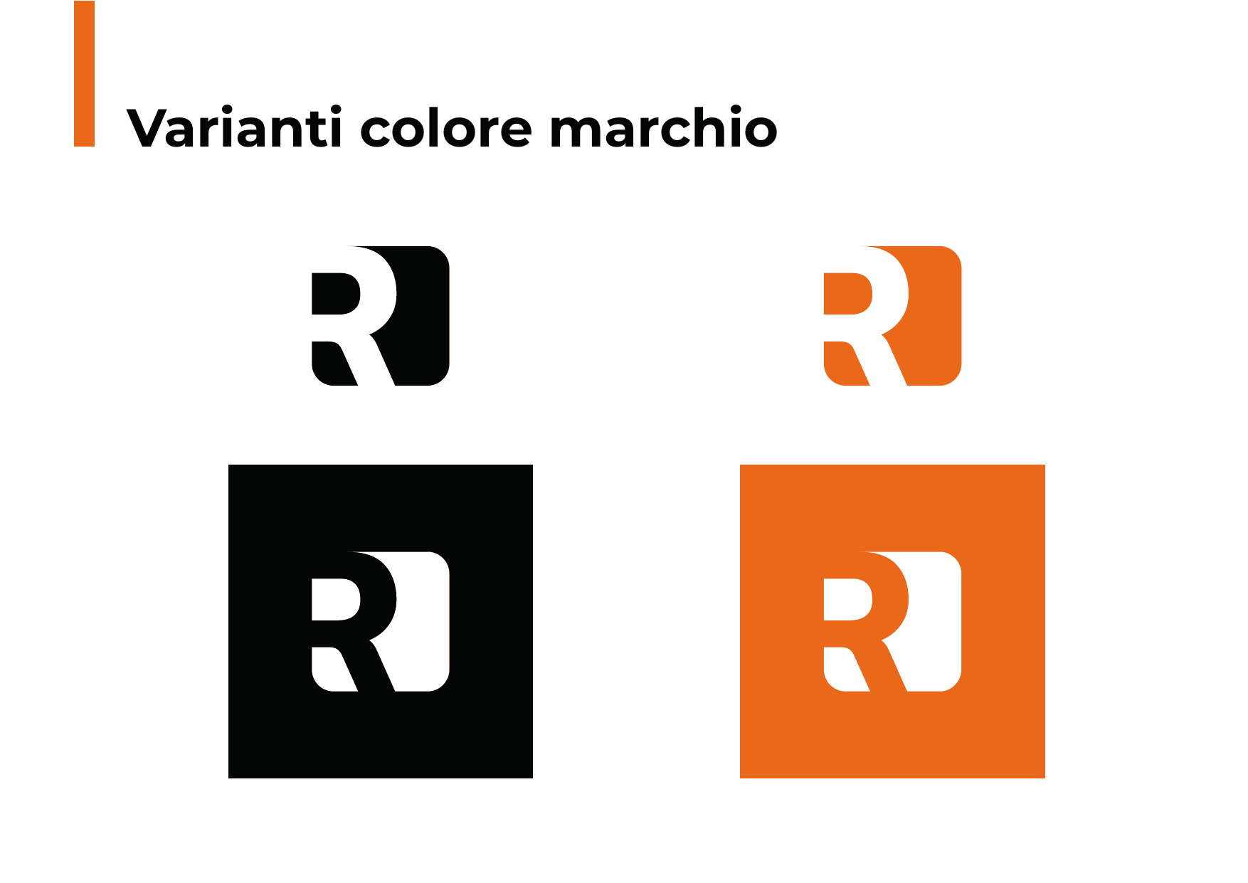
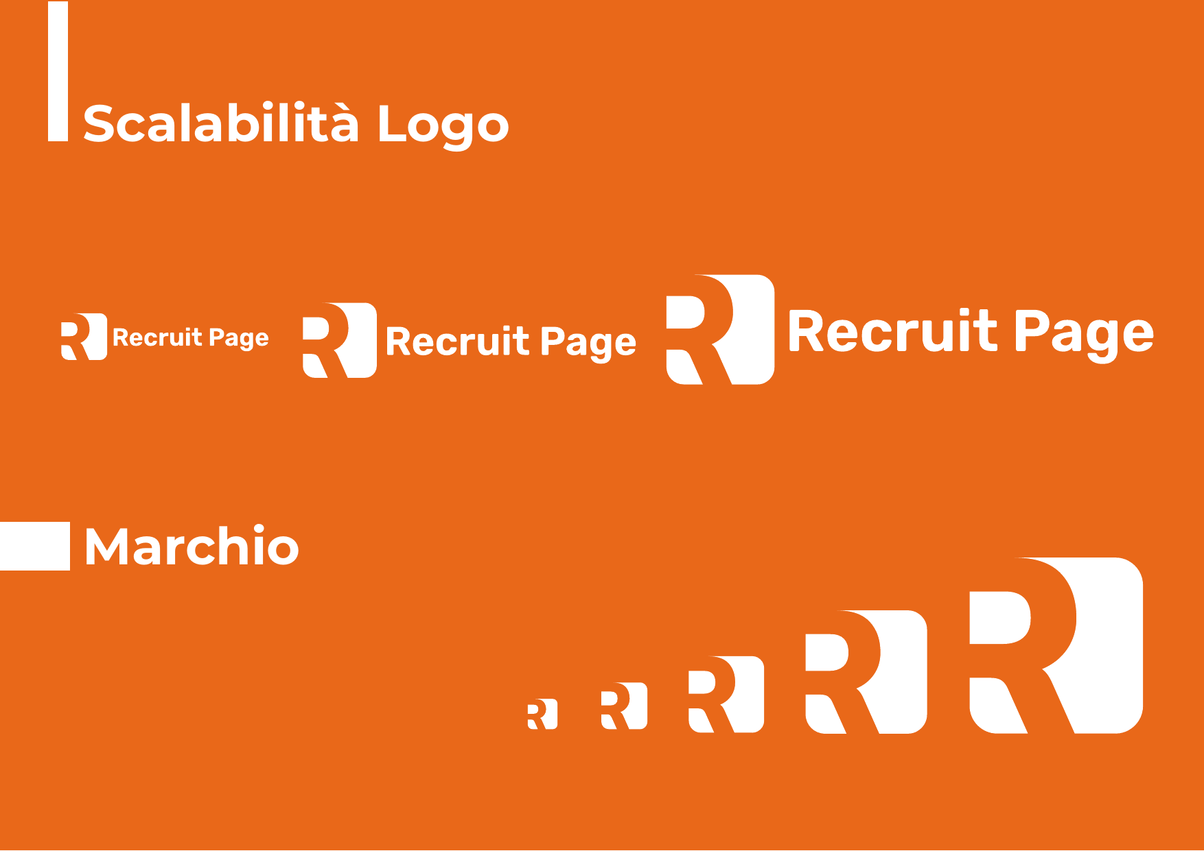
→ Logo Design: Stylized geometric letter "R" with a page-fold detail on the right side, directly referencing the name "Page". Rounded-corner shapes for a friendly, app-icon-ready identity. Bold sans-serif wordmark.
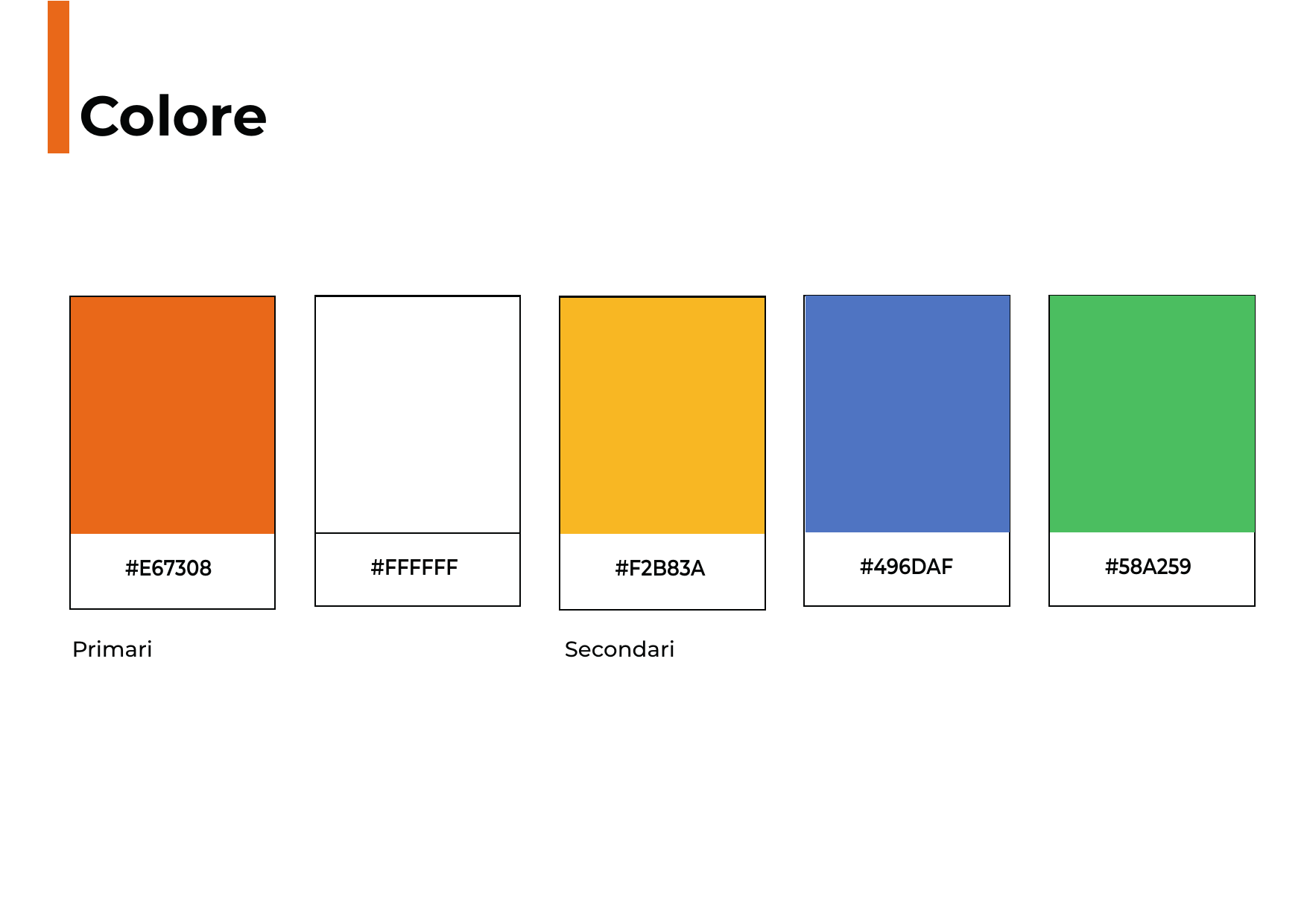
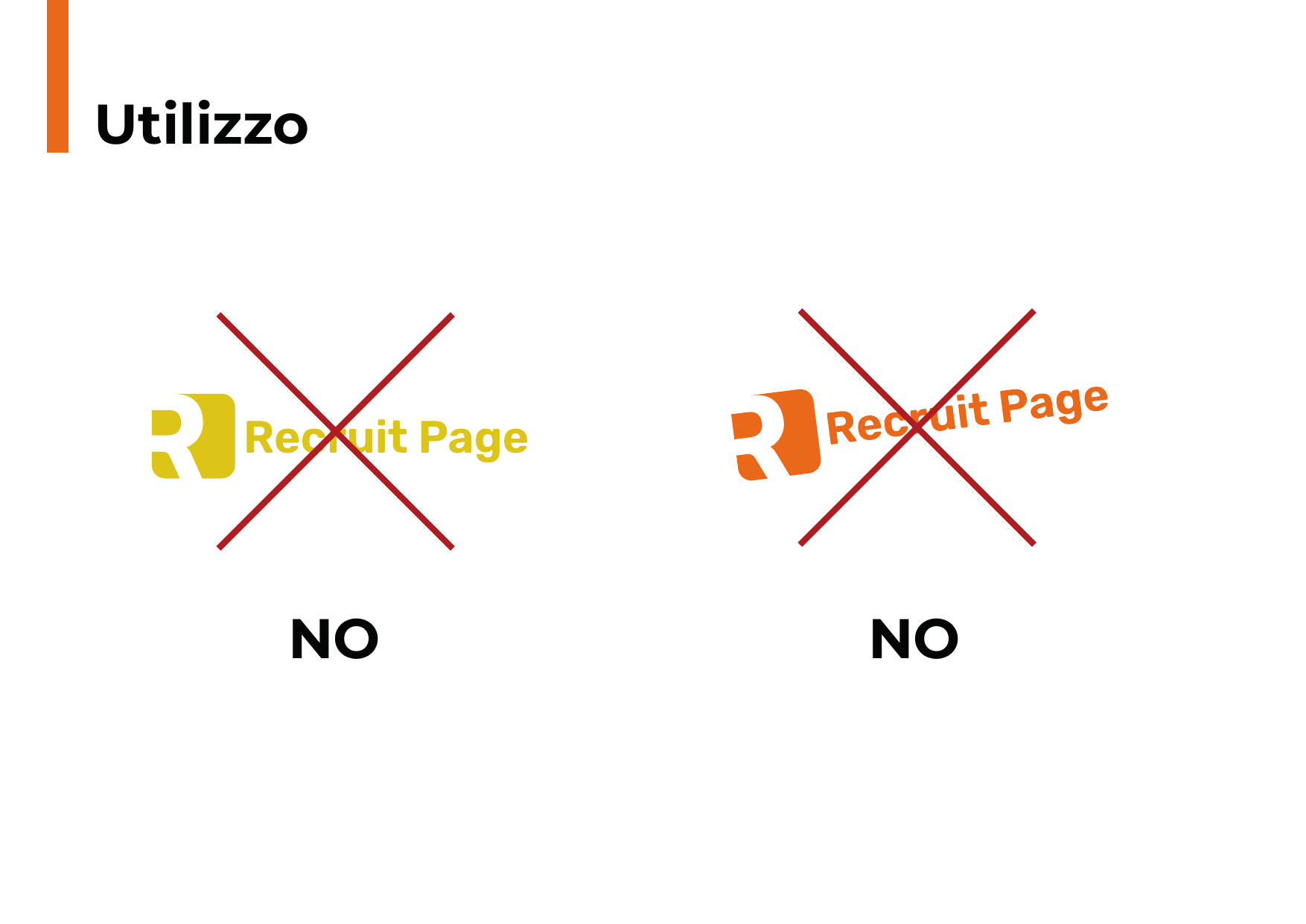
→ Colour System: Warm, vibrant orange as the sole brand colour — associated with energy, enthusiasm, and action — to differentiate from the typical blues and greys of the HR Tech sector.
→ Visual Language: The large "R" becomes a background graphic element, with layered orange tones creating depth. Soft, rounded shapes reinforce brand accessibility.
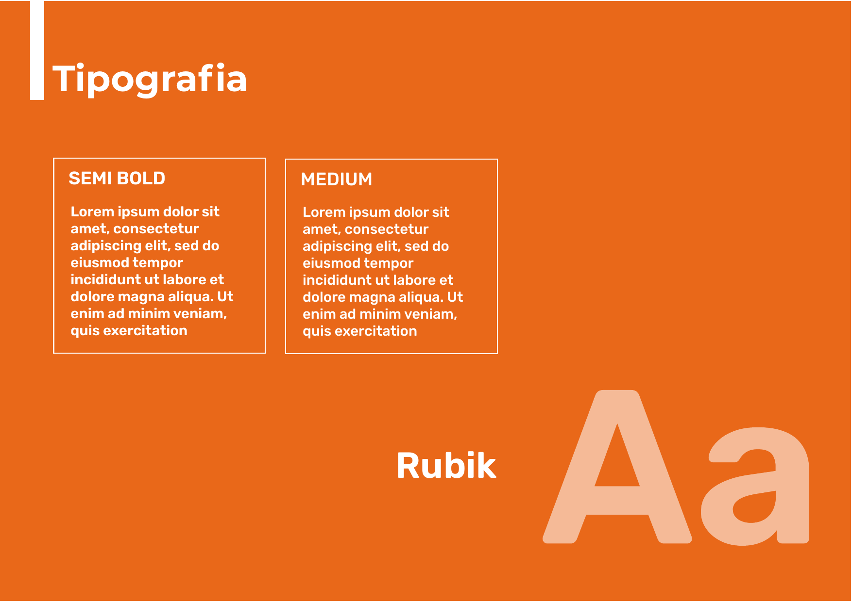
→ Typography: Rounded, modern, tech-forward sans-serif. Bold for headings, lighter weights for subtitles to create visual hierarchy.
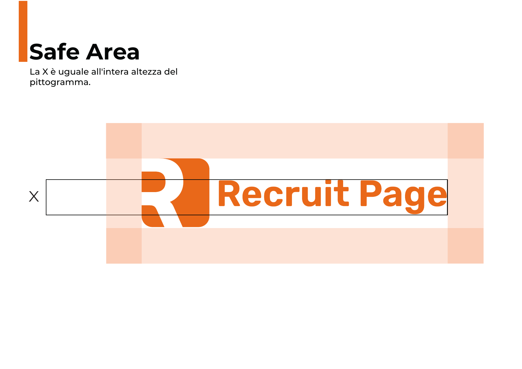
→ Complete Brand Book: 14 pages of guidelines covering logo variants, spacing, and application rules.
RESULTS
• Distinctive orange identity in the HR sector
• Friendly, scalable logo for digital platforms
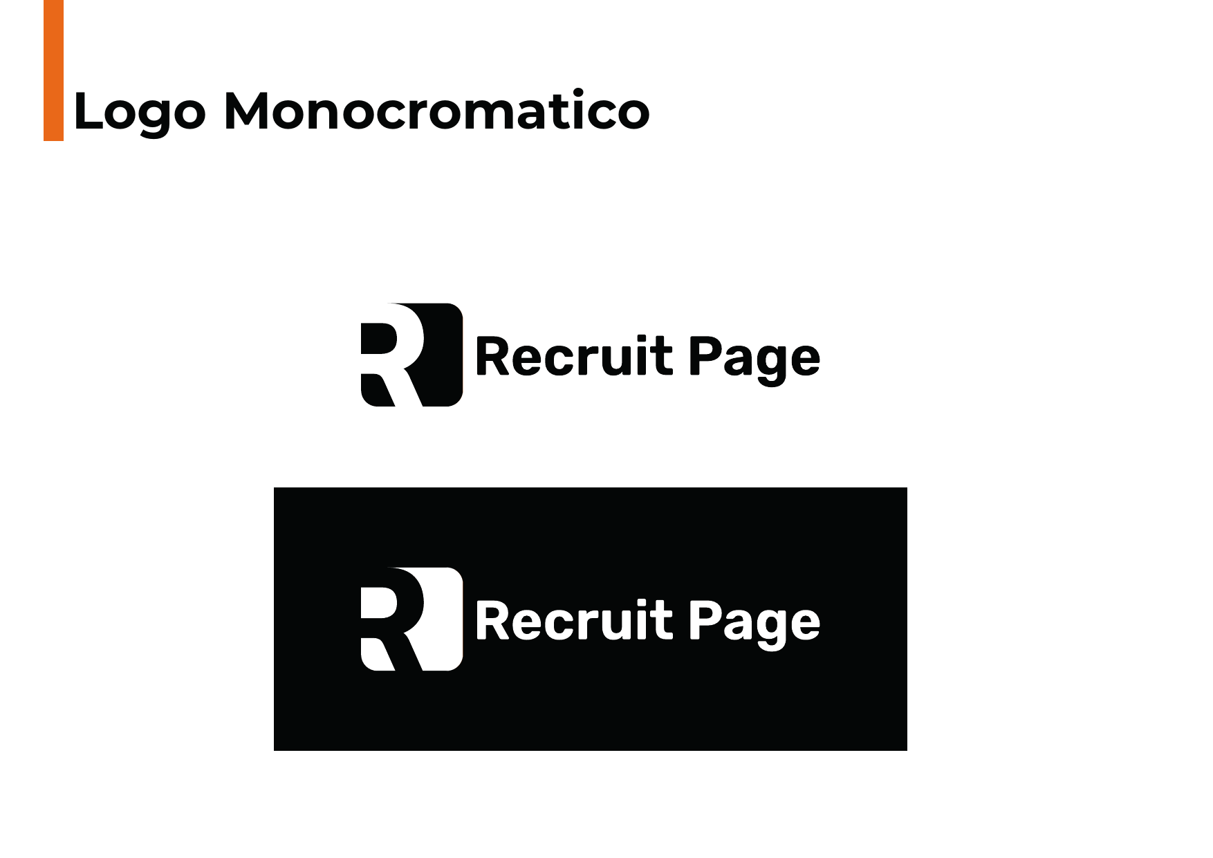
• Monochromatic system for strong brand recognition
Project Gallery
Want similar results?
Every business is different, but efficiency problems often look alike. Let's talk about how we can solve yours.