Softy: Brand Identity for an Enterprise Software Suite
A complete brand identity project for a B2B software tools suite. The challenge: creating an identity that is creative and recognizable without falling into generic enterprise SaaS aesthetics.
The Challenge
An enterprise software suite needed to unify several product verticals under a single identity. The challenge: appearing accessible and creative — not yet another generic B2B brand — while maintaining the credibility needed for enterprise clients.
The brand had to work across multiple products, be flexible in its visual system, and stand out in an increasingly crowded SaaS market.
The Solution
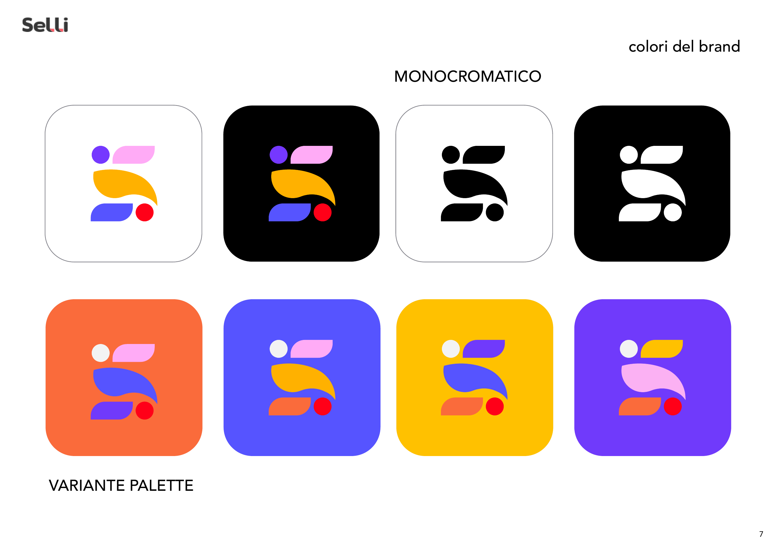
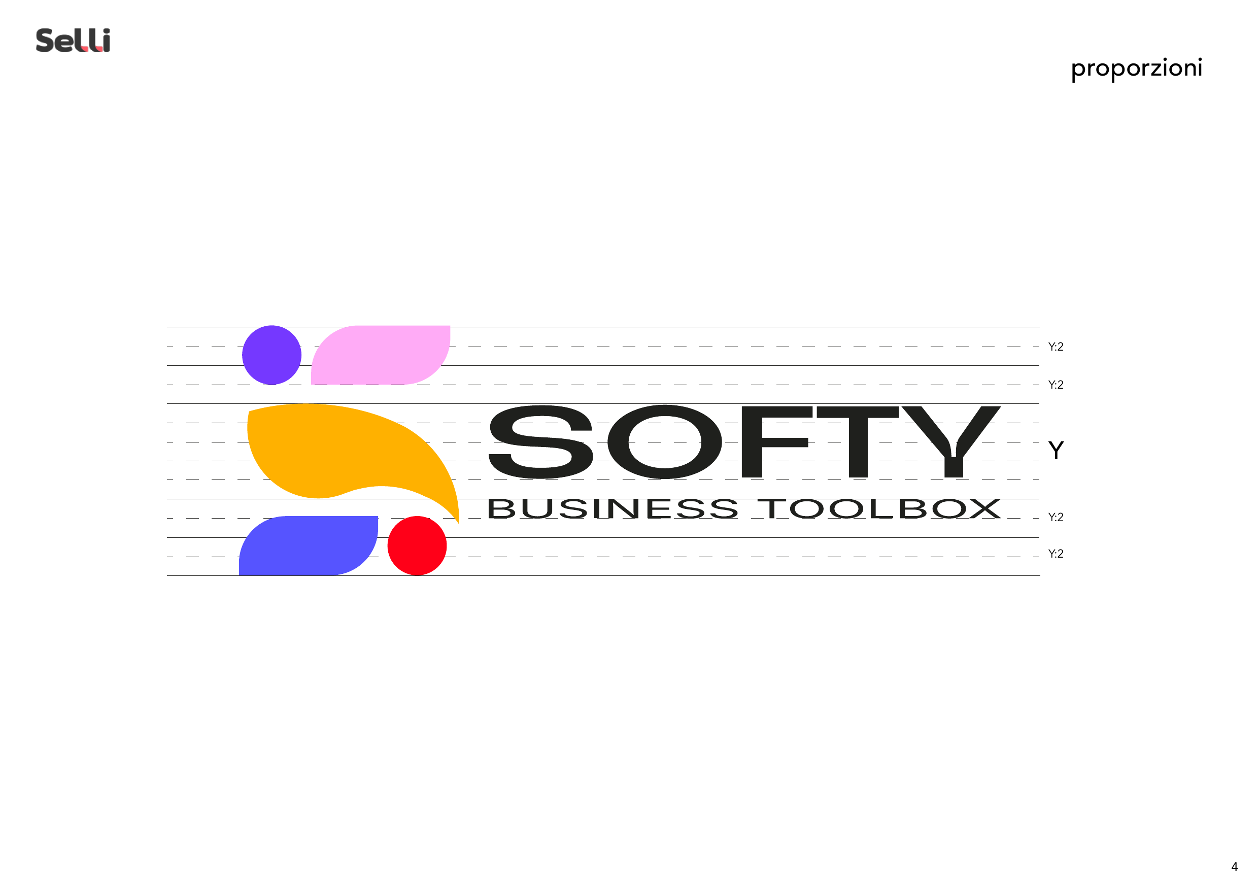
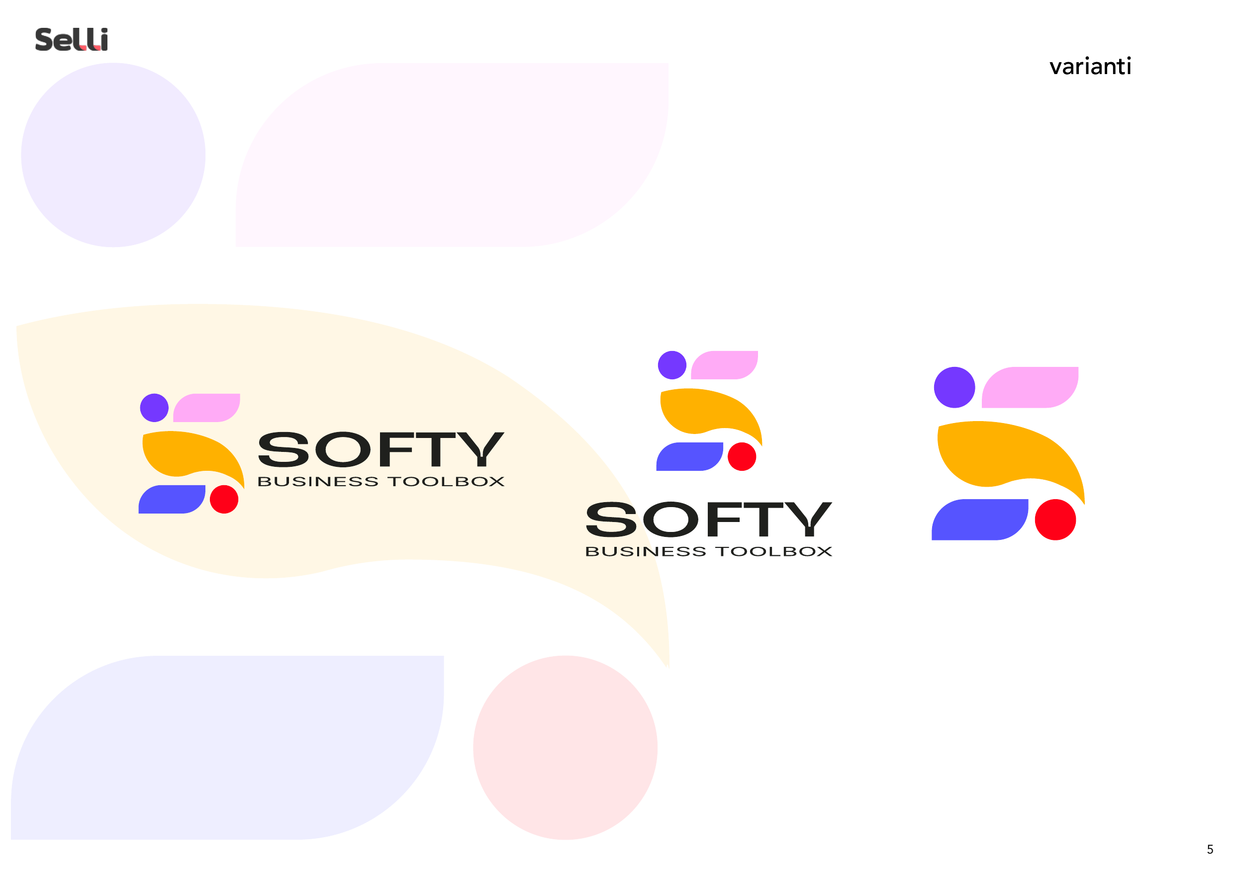
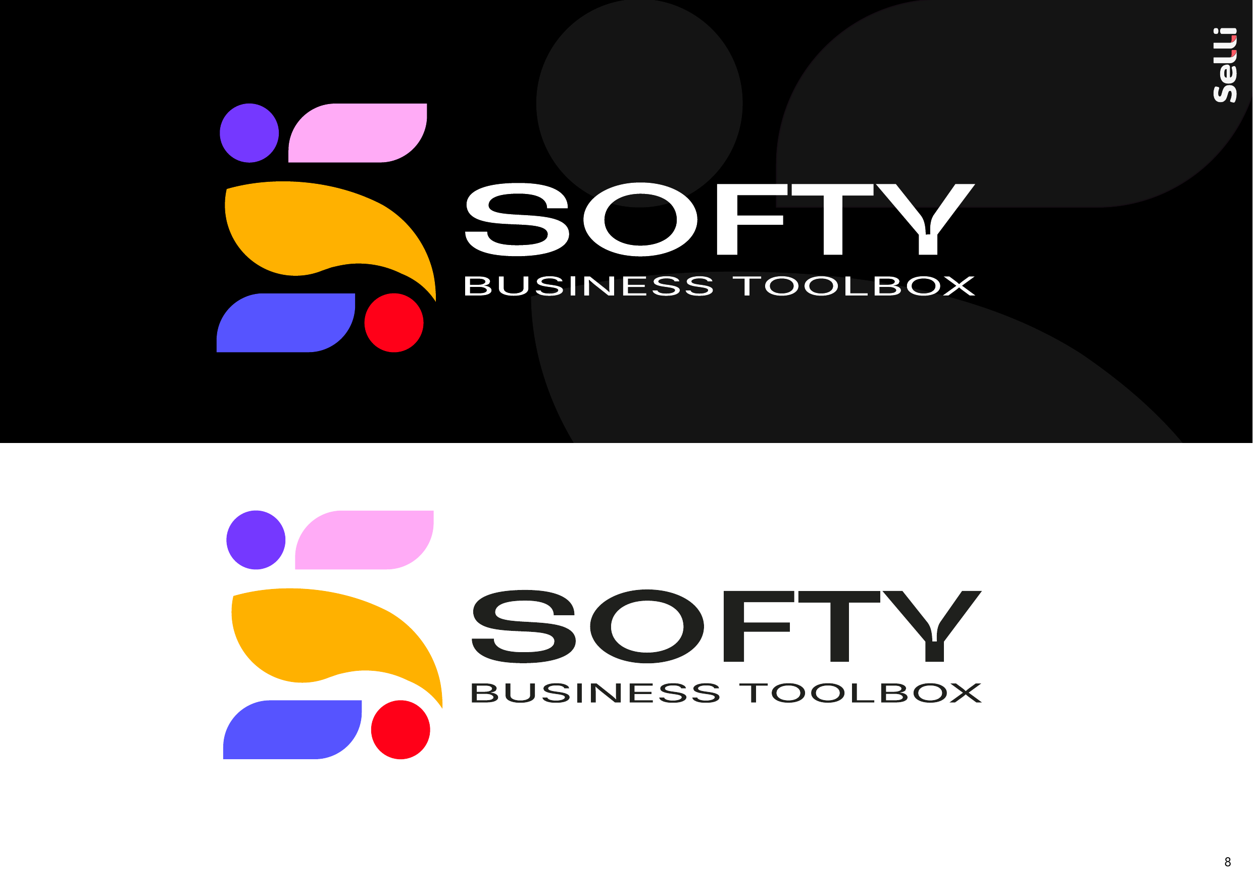
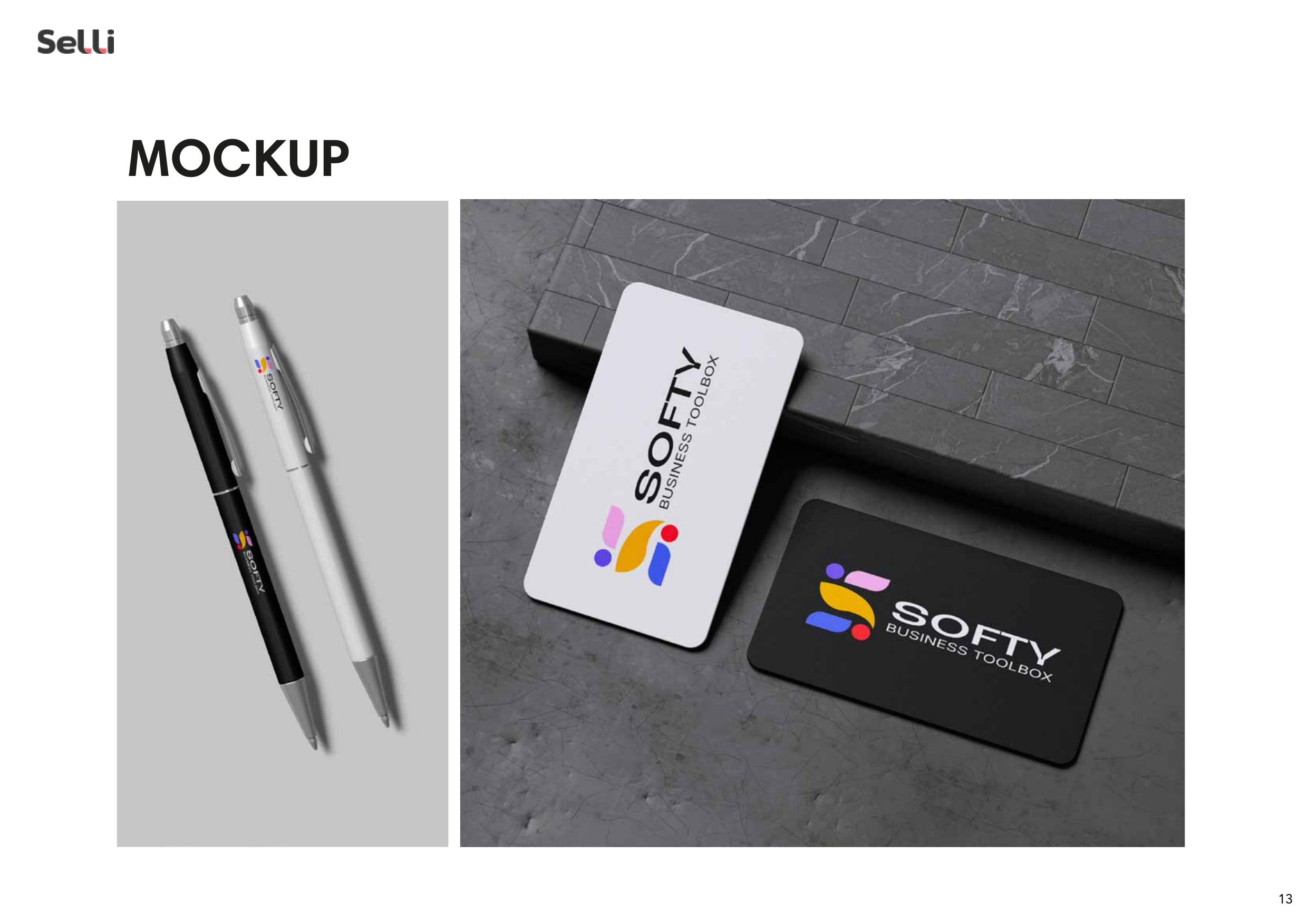
→ Logo Design: Abstract "S" mark built with organic, playful shapes — leaves, rounded rectangles, and circles — creating a modular, dynamic icon. Bold geometric wordmark with spaced italic "BUSINESS TOOLBOX" tagline.
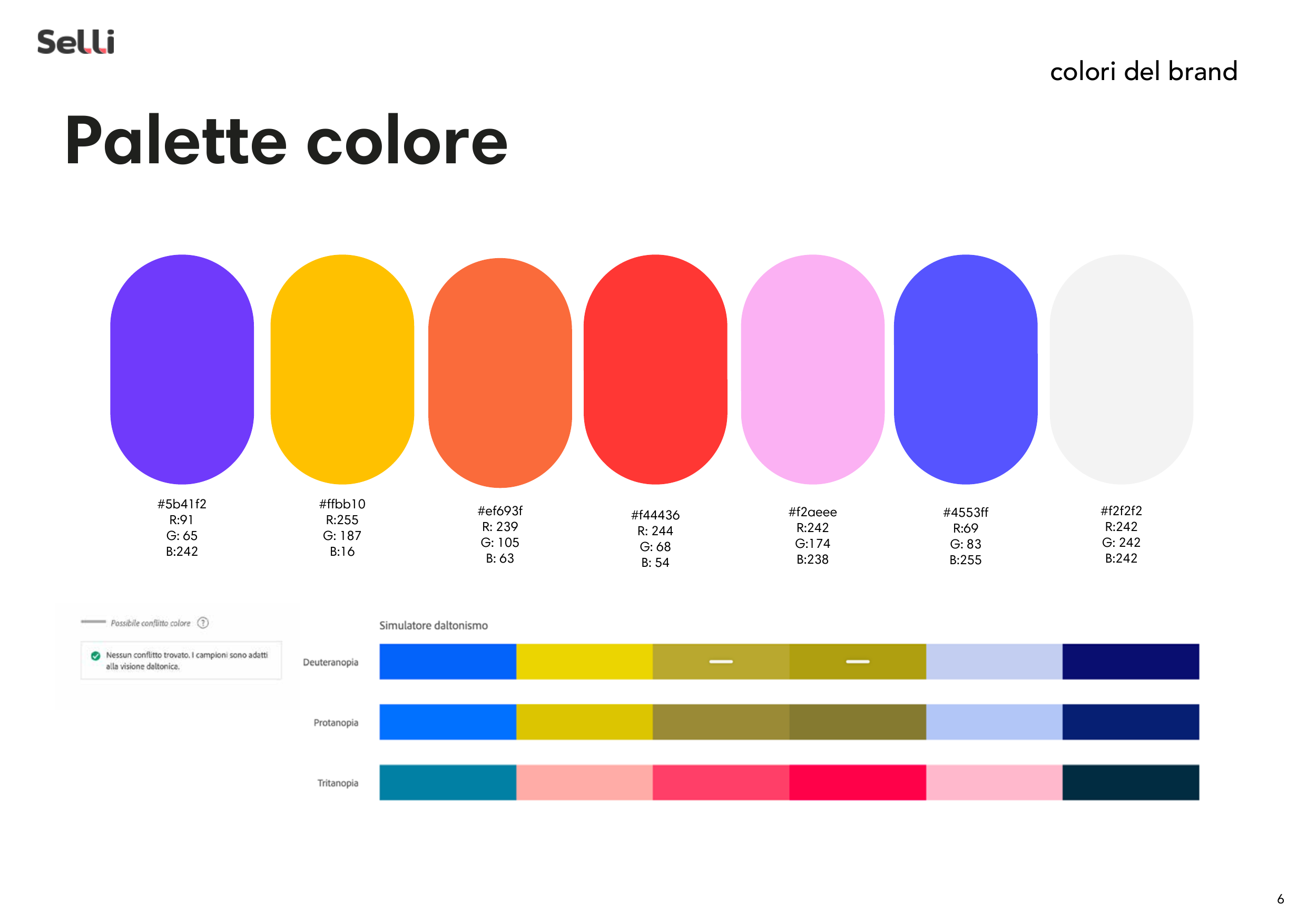
→ Colour System: Vibrant multi-colour palette (purple, magenta, amber, royal blue, red) on dominant dark backgrounds. Pastel variants for light-mode applications.
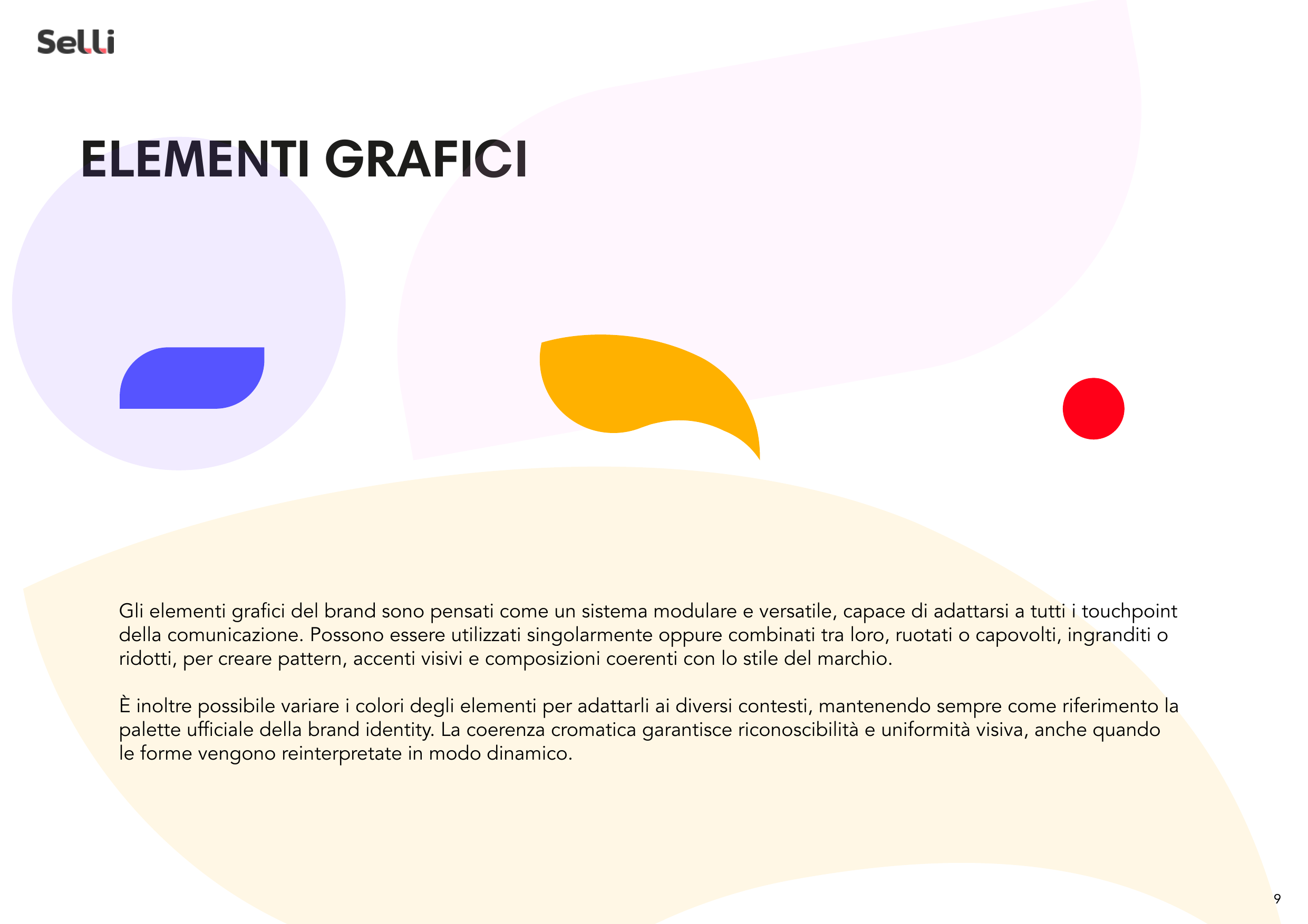
→ Visual Language: Large organic blob shapes as recurring decorative motifs, creating depth through layering and transparency. Dark-mode-first design with light-mode variants.
→ Typography: Wide geometric sans-serif for headings, refined humanist sans for body — pairing impact with readability.
→ Complete Brand Book: 16 pages of guidelines covering the full visual system, sub-brand architecture, and application rules.
Key Results
Project Gallery
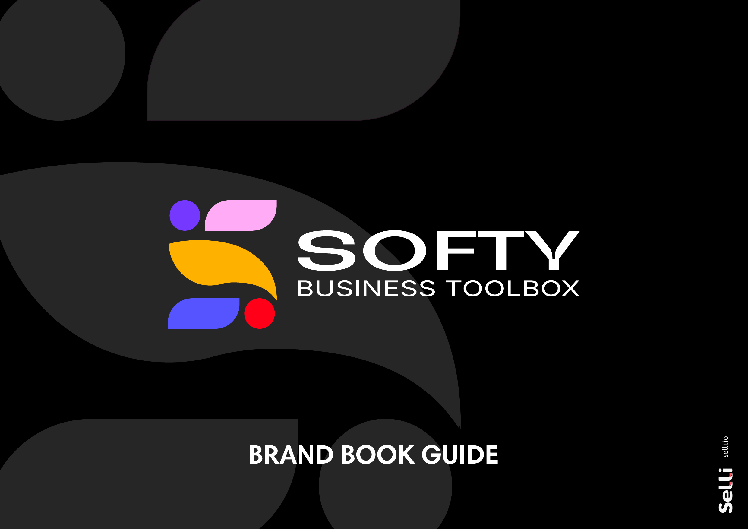
Cover — Brand Book Guide
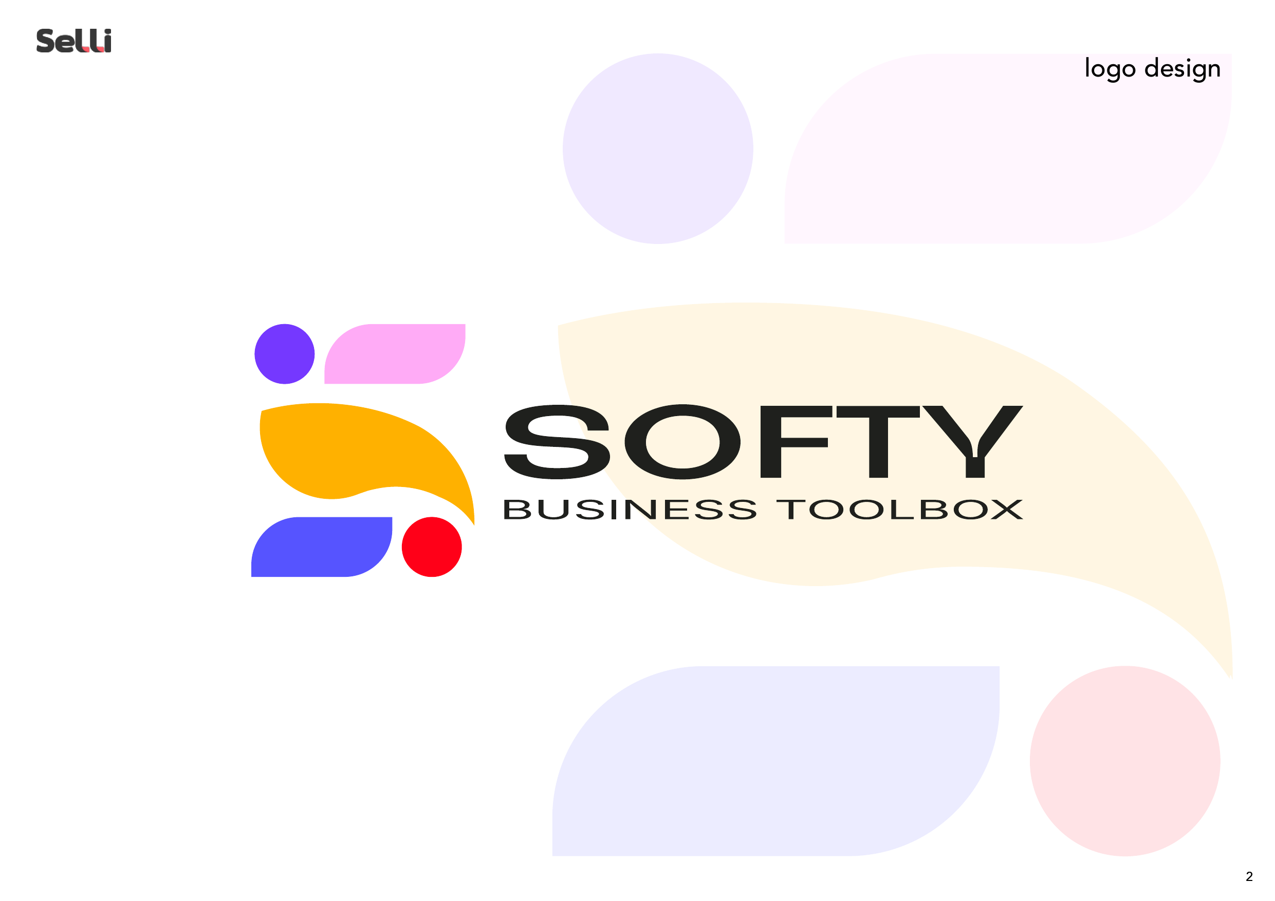
Logo Design e costruzione
Variante logo
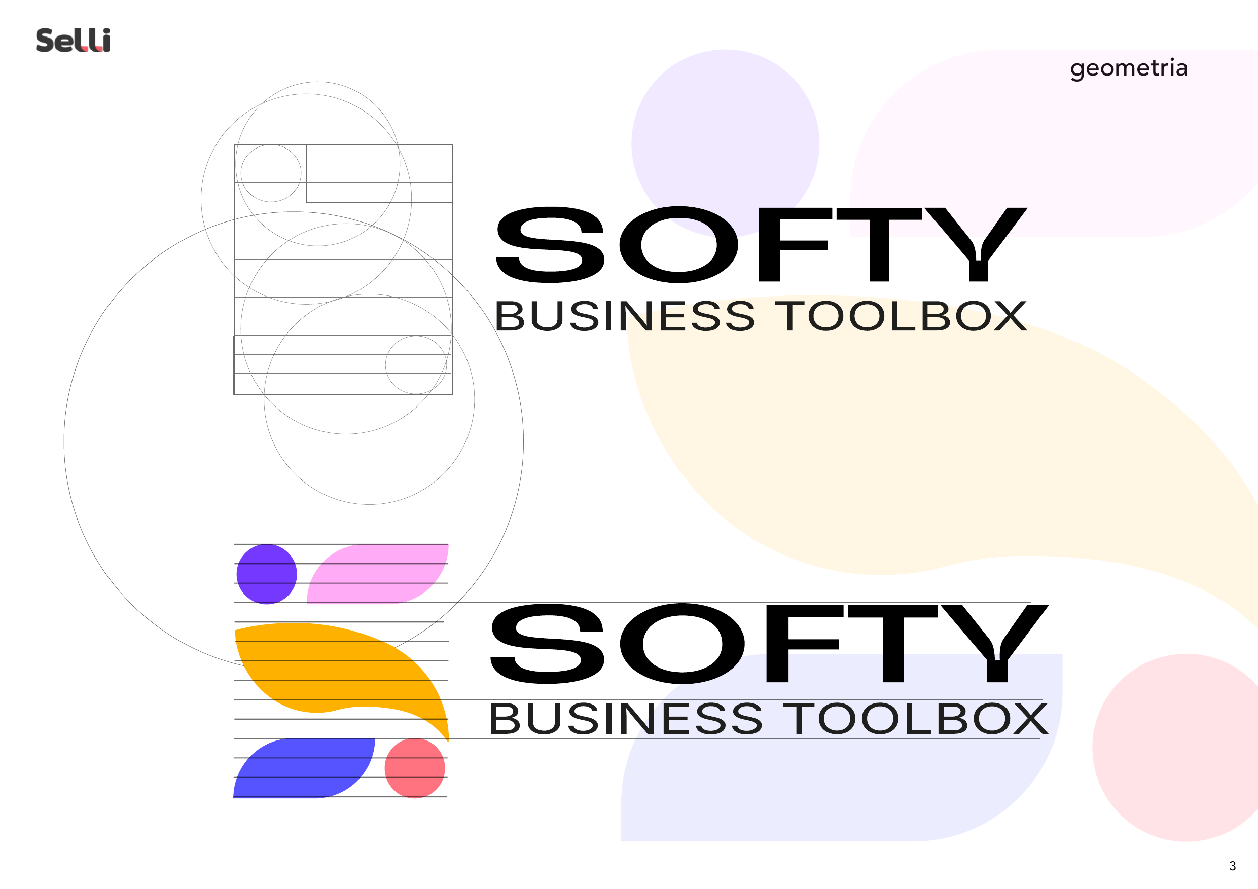
Scalabilità
Varianti e lockup
Tipografia
Palette colori
Utilizzo del logo
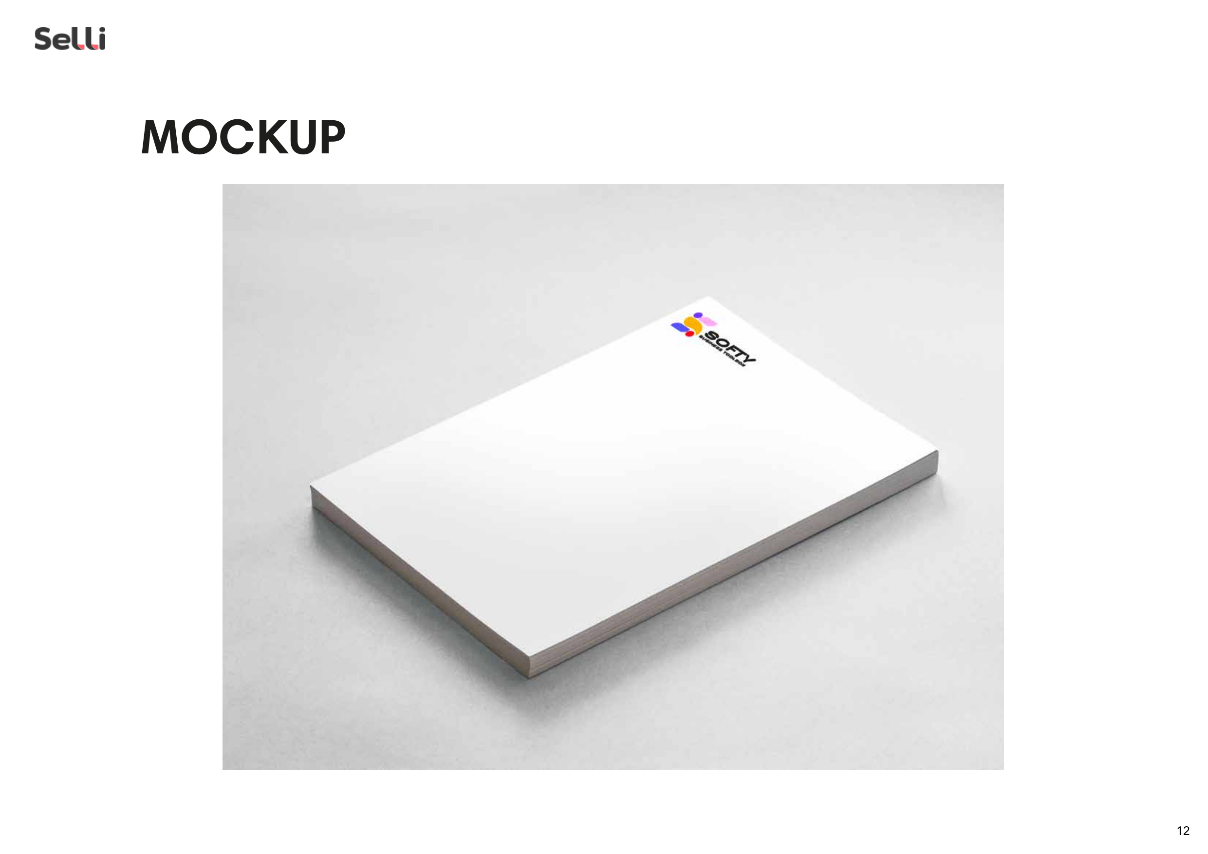
Mockup cancelleria
Set completo cancelleria
Firma email
Applicazioni stampa
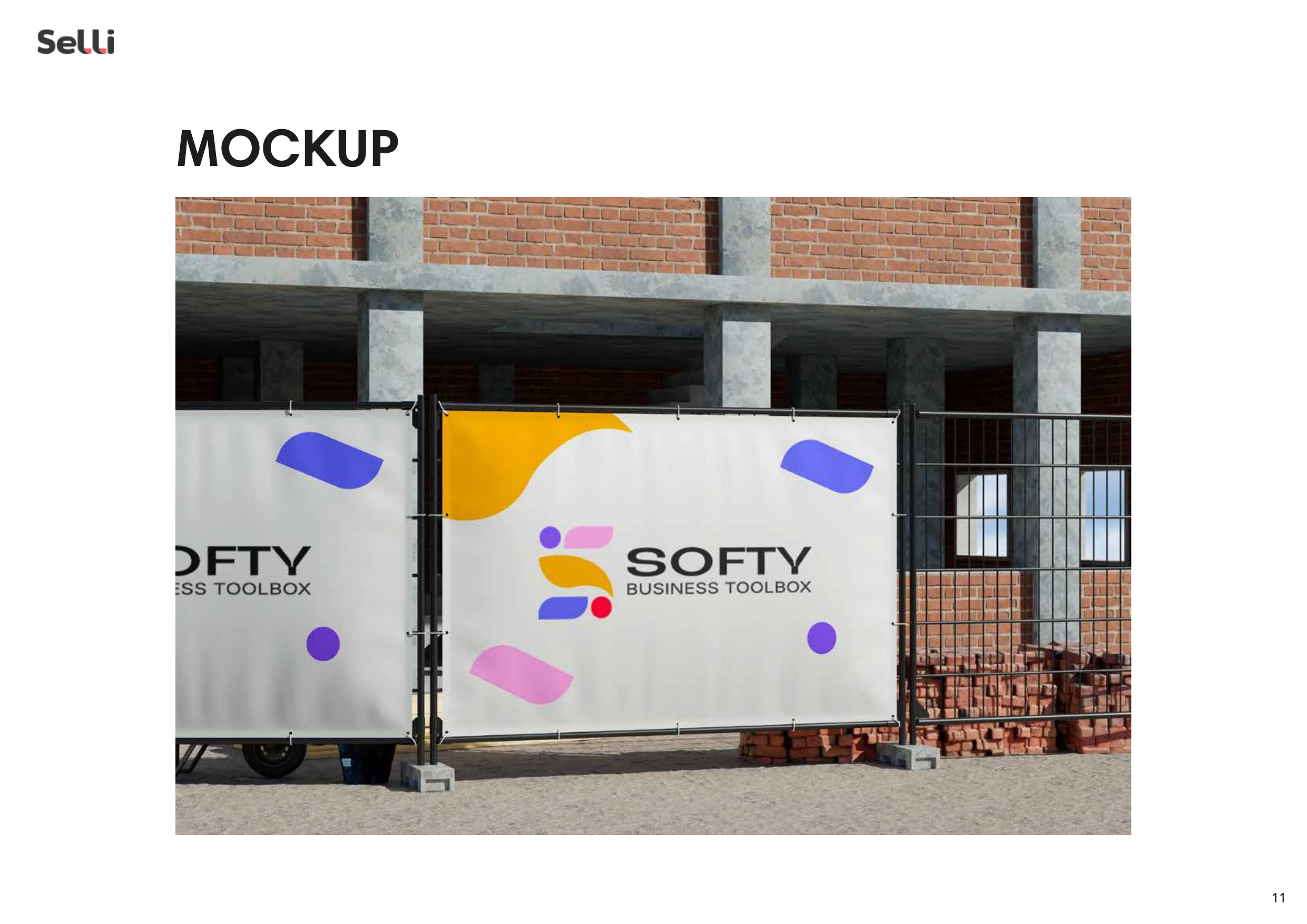
Mockup finale
Want similar results?
Every business is different, but efficiency problems often look alike. Let's talk about how we can solve yours.