Startup Sonar: Brand Identity for a Business Intelligence Platform
A complete brand identity project for Startup Sonar, a SaaS business intelligence platform that helps entrepreneurs and investors identify market opportunities by analysing real user signals. The visual identity needed to convey innovation, data clarity and technological reliability.
The Challenge
Startup Sonar is a business intelligence platform that analyses real user needs to uncover business opportunities. It needed a visual identity that communicated three core values: the ability to detect hidden signals in market noise, a data-driven approach, and a commitment to technological innovation.
The challenge: creating a brand that spoke to both the startup world (dynamic, bold) and the enterprise world (reliable, structured), while remaining recognisable and memorable in a crowded SaaS landscape.
The Solution
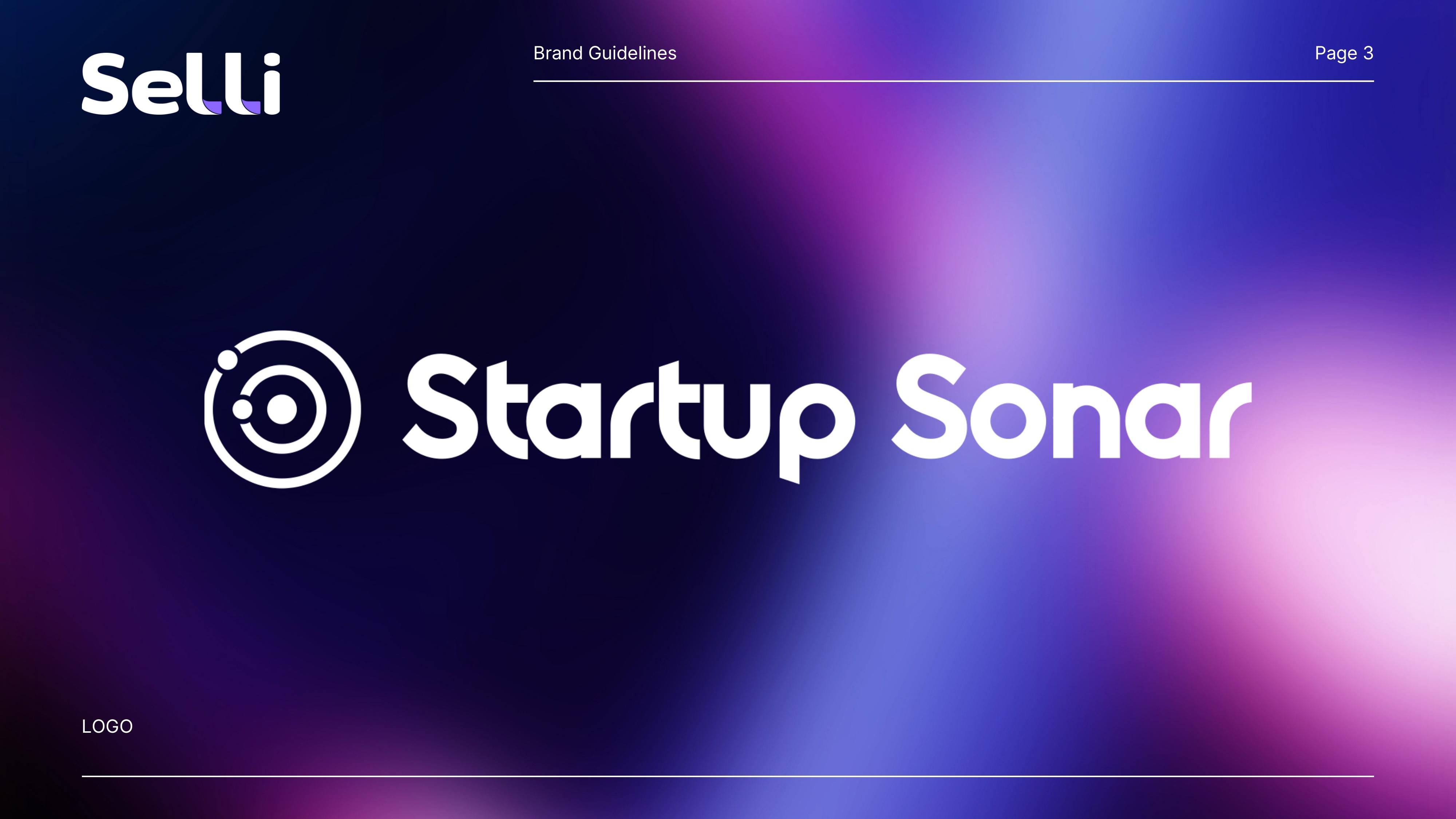
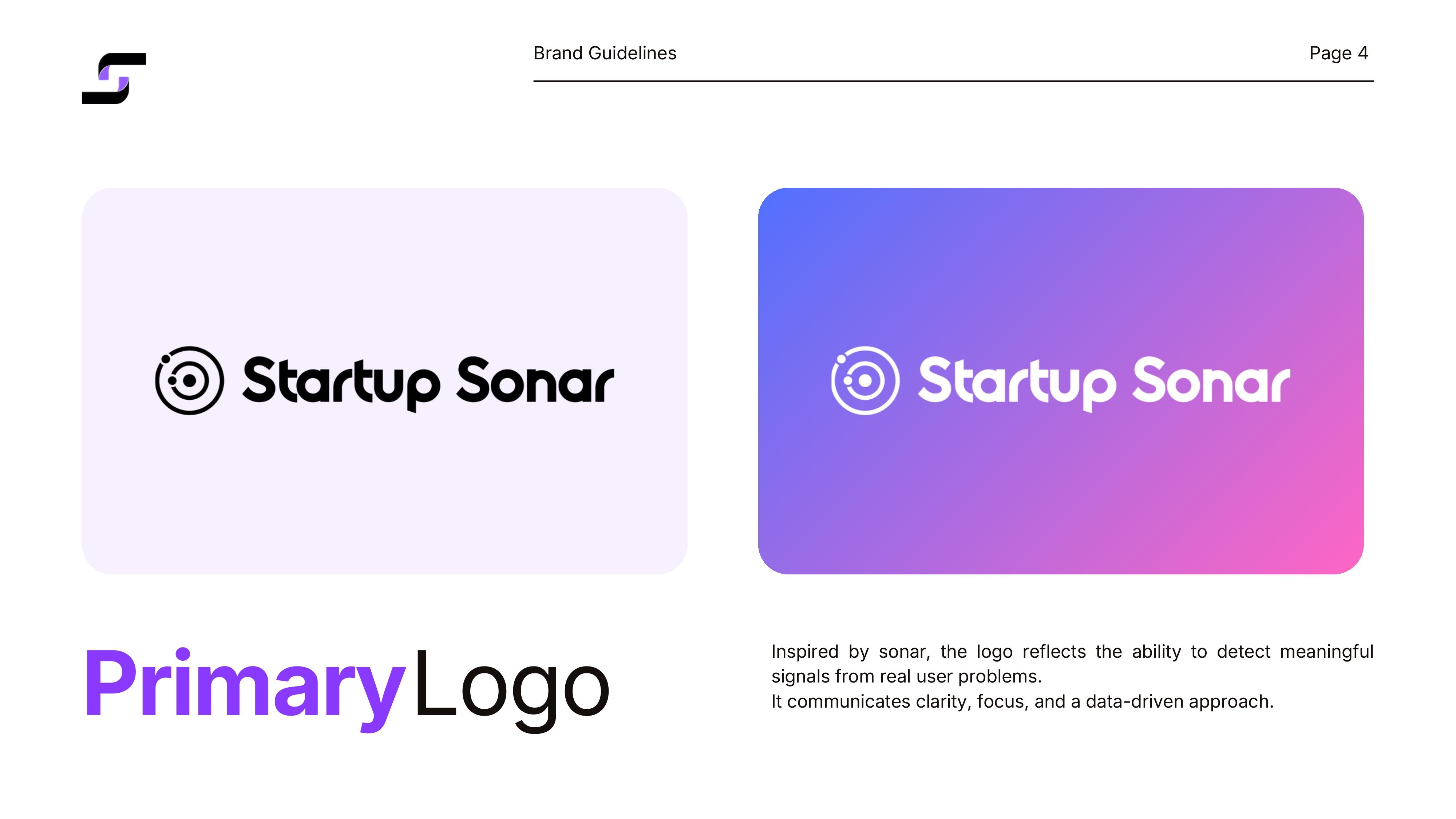
→ Logo Design: A sonar icon composed of concentric circles with orbital dots — a direct reference to radar detecting signals in noise. The symbol communicates scanning, discovery and precision. The wordmark uses a rounded geometric font (Inter) to balance technology and accessibility.
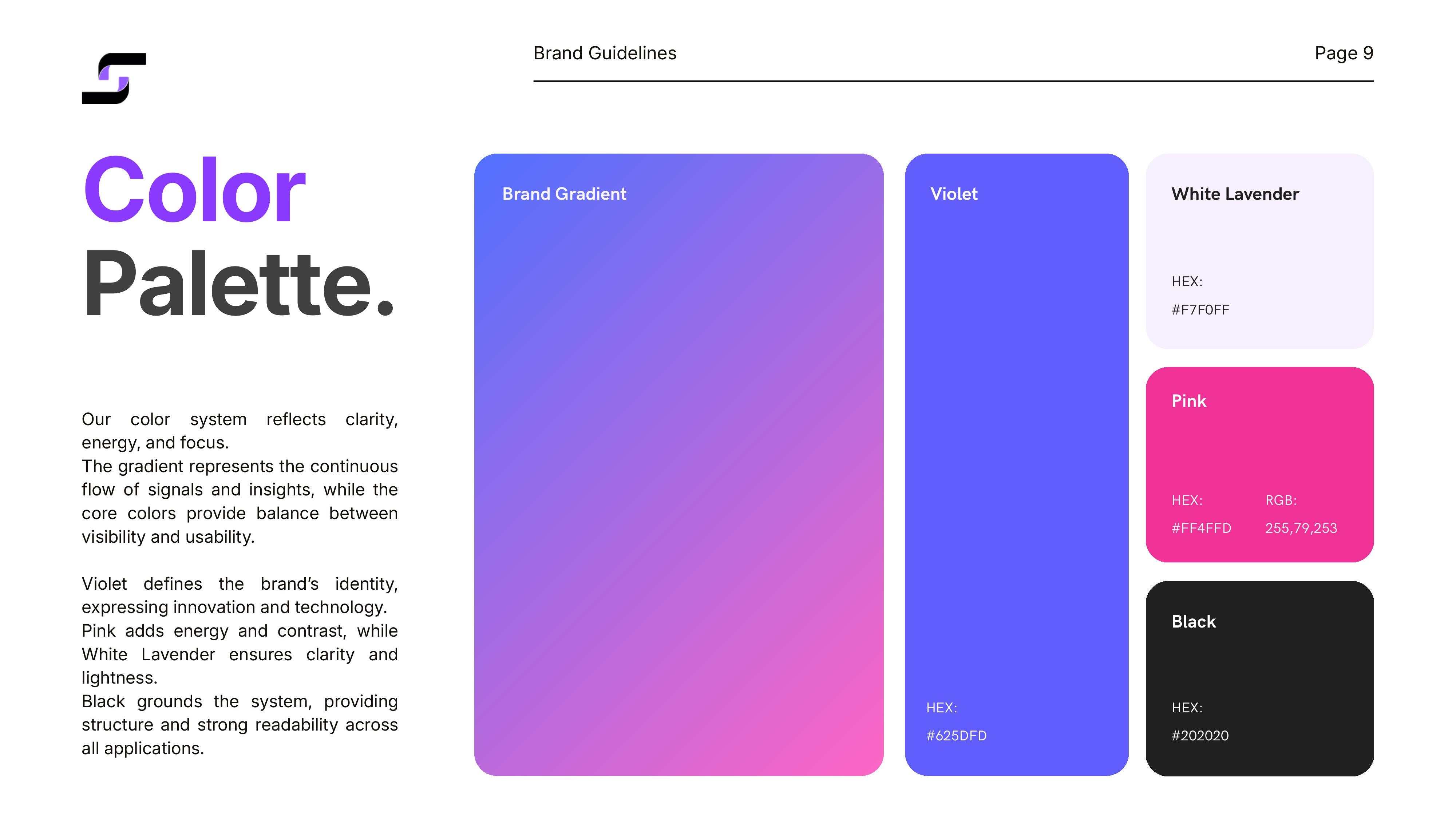
→ Colour Palette: A gradient-based colour system — from deep violet (#625DFD) to vibrant magenta (#FF4FFD), through lavender (#F7F0FF) and black (#202020). The gradient represents the continuous flow of signals and insights, while the core colours balance visibility and usability.
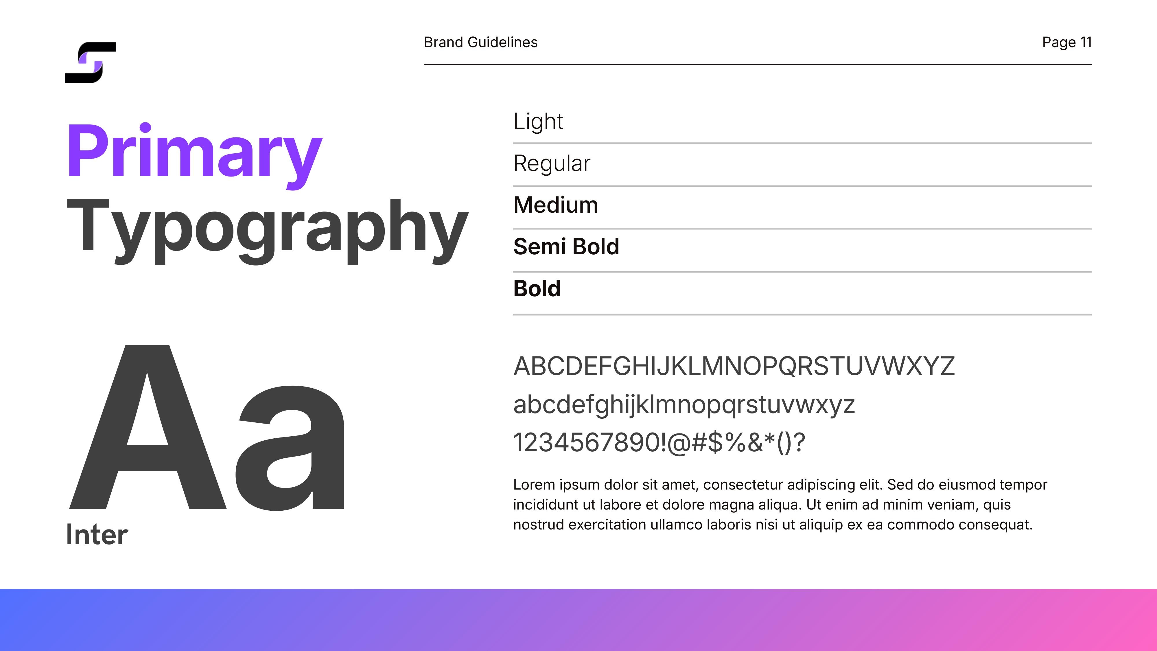
→ Typography: Inter in five weights (Light, Regular, Medium, Semi Bold, Bold) — a versatile typeface ensuring readability on screen and in print, with a tech-forward yet human character.
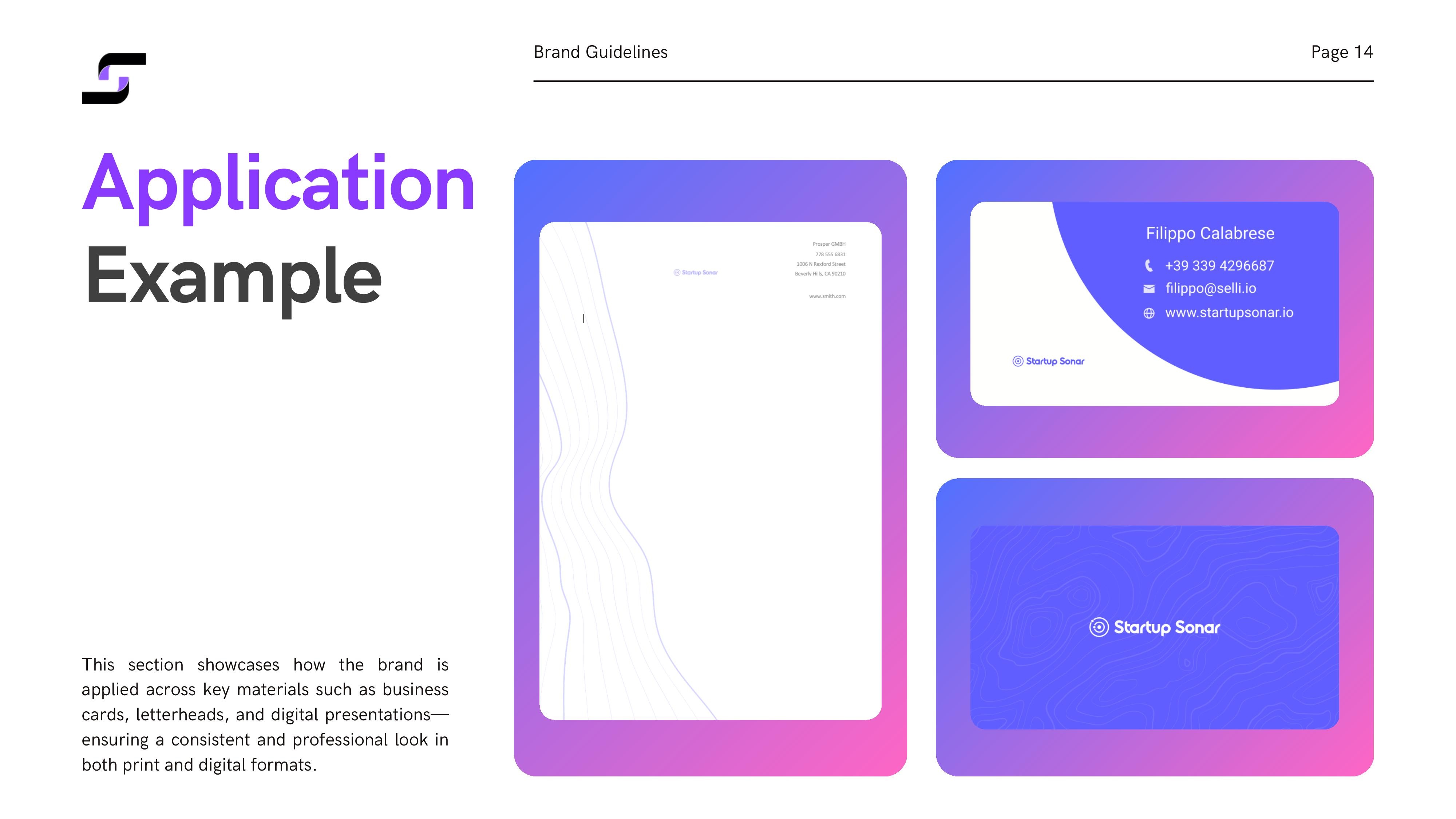
→ Brand Guidelines: A comprehensive 15-page manual covering logo usage rules, safe zones, colour variants, incorrect usage, colour palette, typography and mockup applications (mobile app, stationery, business cards).
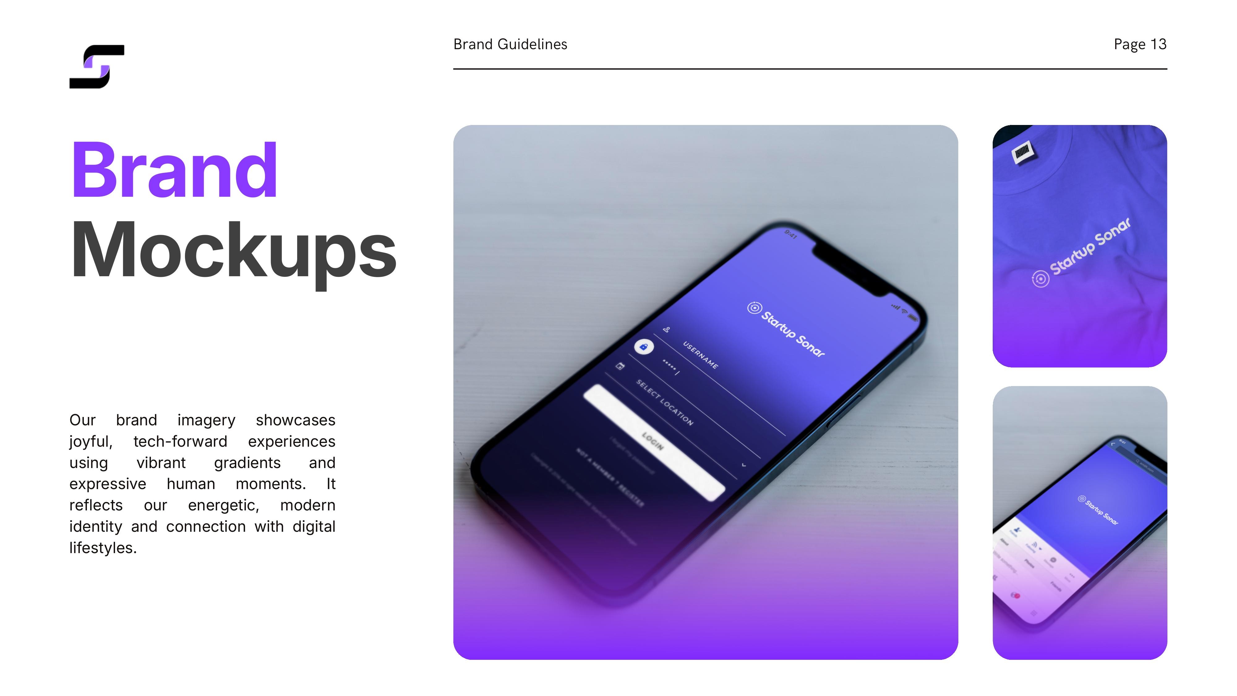
→ Applications: Identity applied across the platform UI, mobile app mockup, business cards and corporate stationery — all consistent with the gradient system and defined visual language.
Key Results
Project Gallery
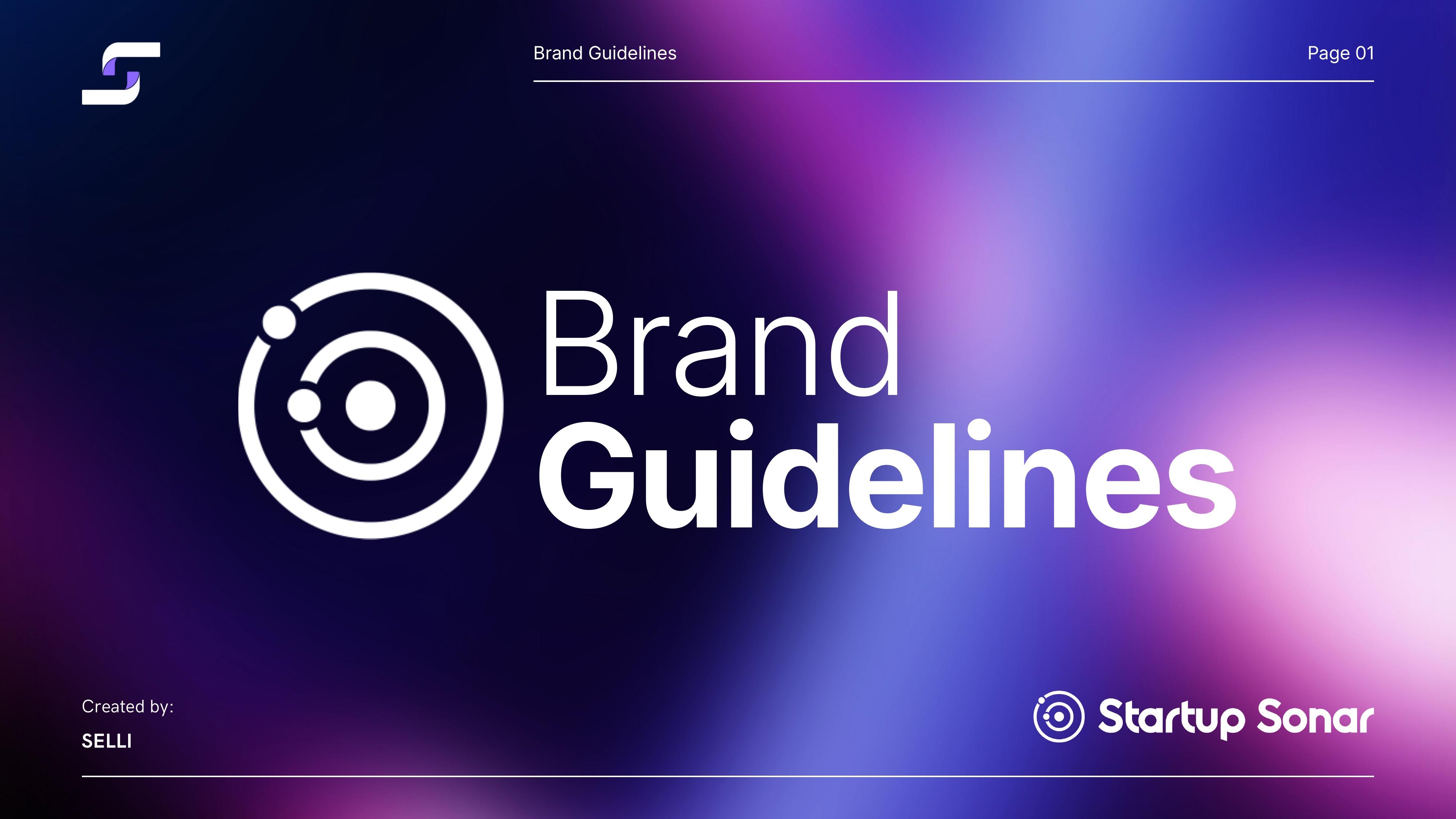
Cover — Brand Guidelines
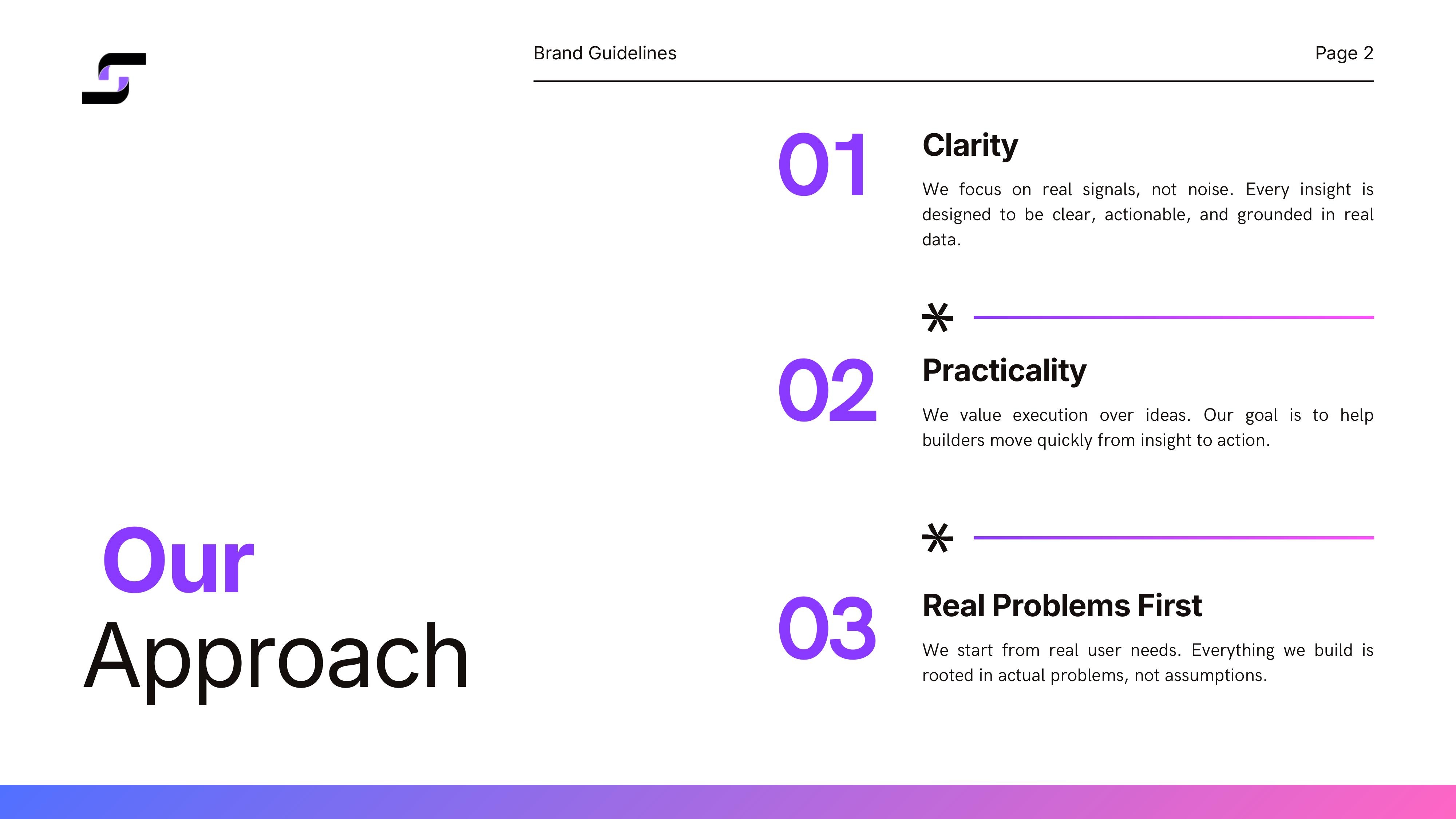
Il nostro approccio: Clarity, Practicality, Real Problems First
Logo principale — lockup orizzontale
Logo primario su sfondo chiaro e gradiente
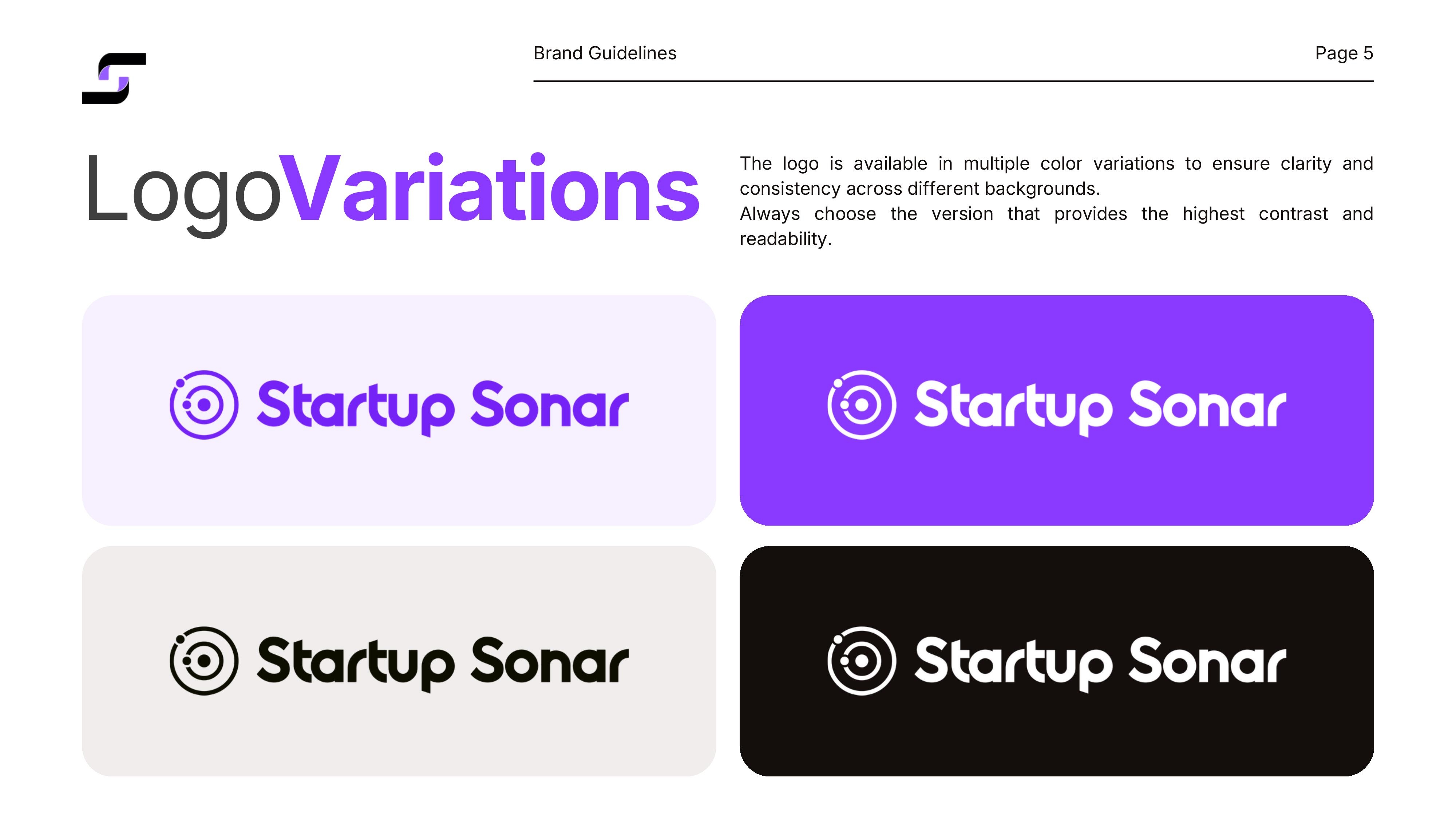
Varianti del logo su diversi sfondi
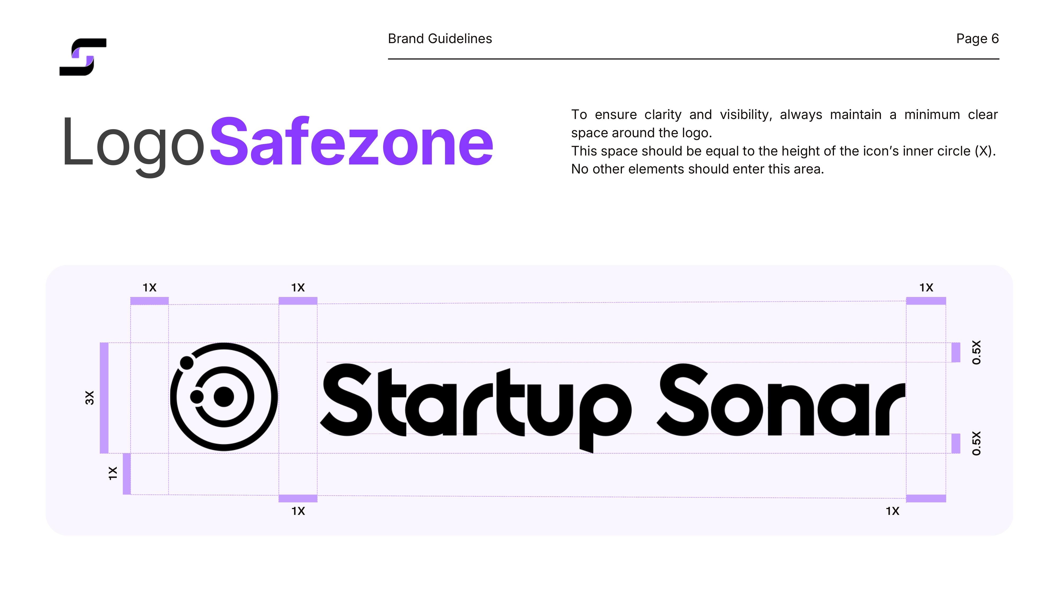
Safezone e spaziature del logo
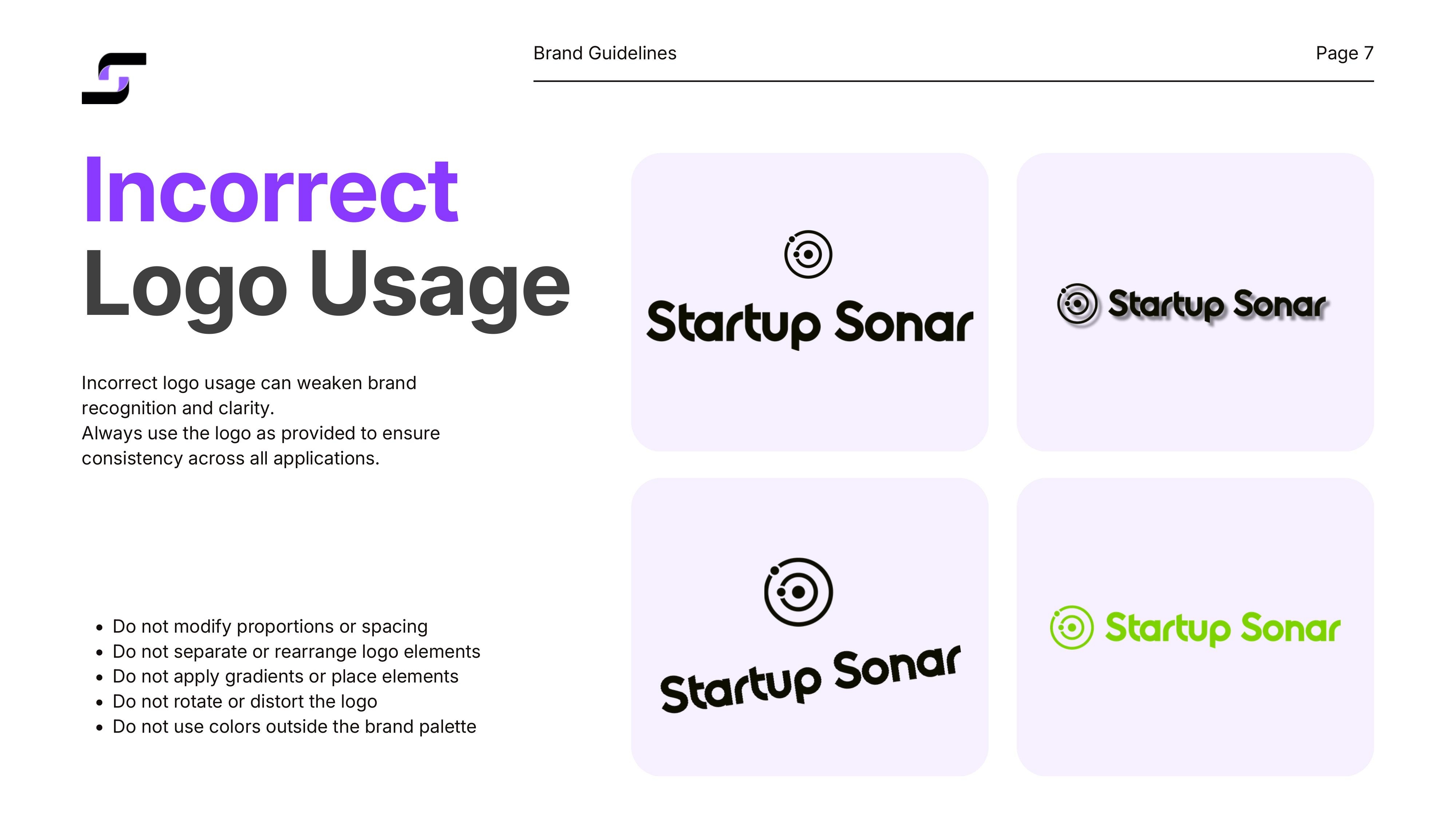
Utilizzi scorretti del logo
Sezione Palette Colori
Palette colori: Violet #625DFD, Pink #FF4FFD, White Lavender #F7F0FF, Black #202020
Sezione Tipografia
Tipografia primaria — Inter (5 pesi)
Sezione Brand Imagery
Mockup: app mobile e t-shirt
Applicazioni: letterhead e biglietti da visita
Thank You — chiusura Brand Guidelines
Want similar results?
Every business is different, but efficiency problems often look alike. Let's talk about how we can solve yours.